Case Study
Nice to meet you, I’m Clayton Deloach! Based in the Dallas-Fort Worth Area as a UX Designer who makes complicated ideas/designs simple and easy for anyone to understand. The UX Portfolio Project was made during the Spring semester for the UX Design Process at the University of Texas at Arlington.
Project Overview
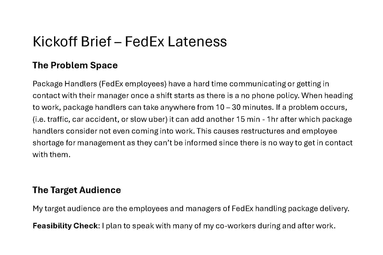
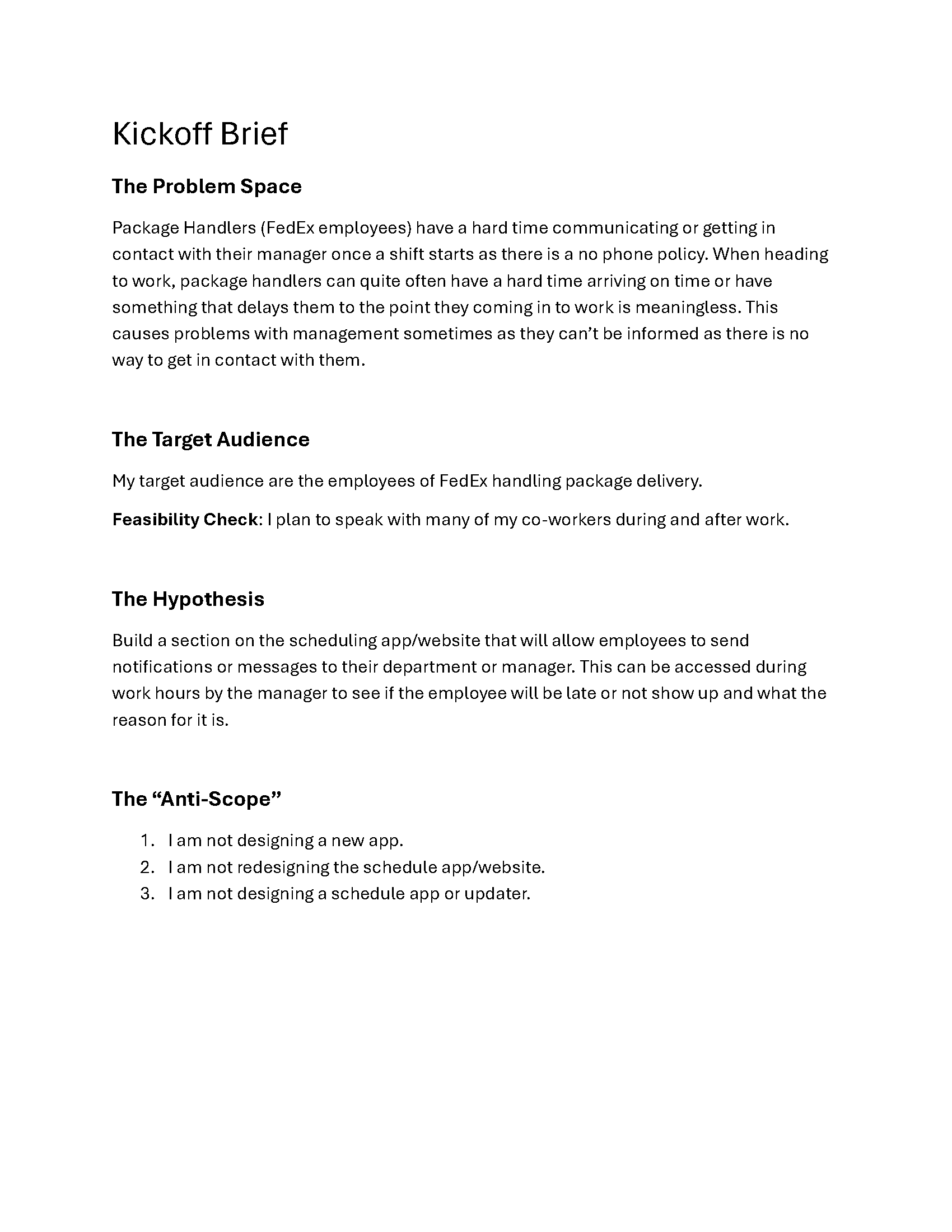
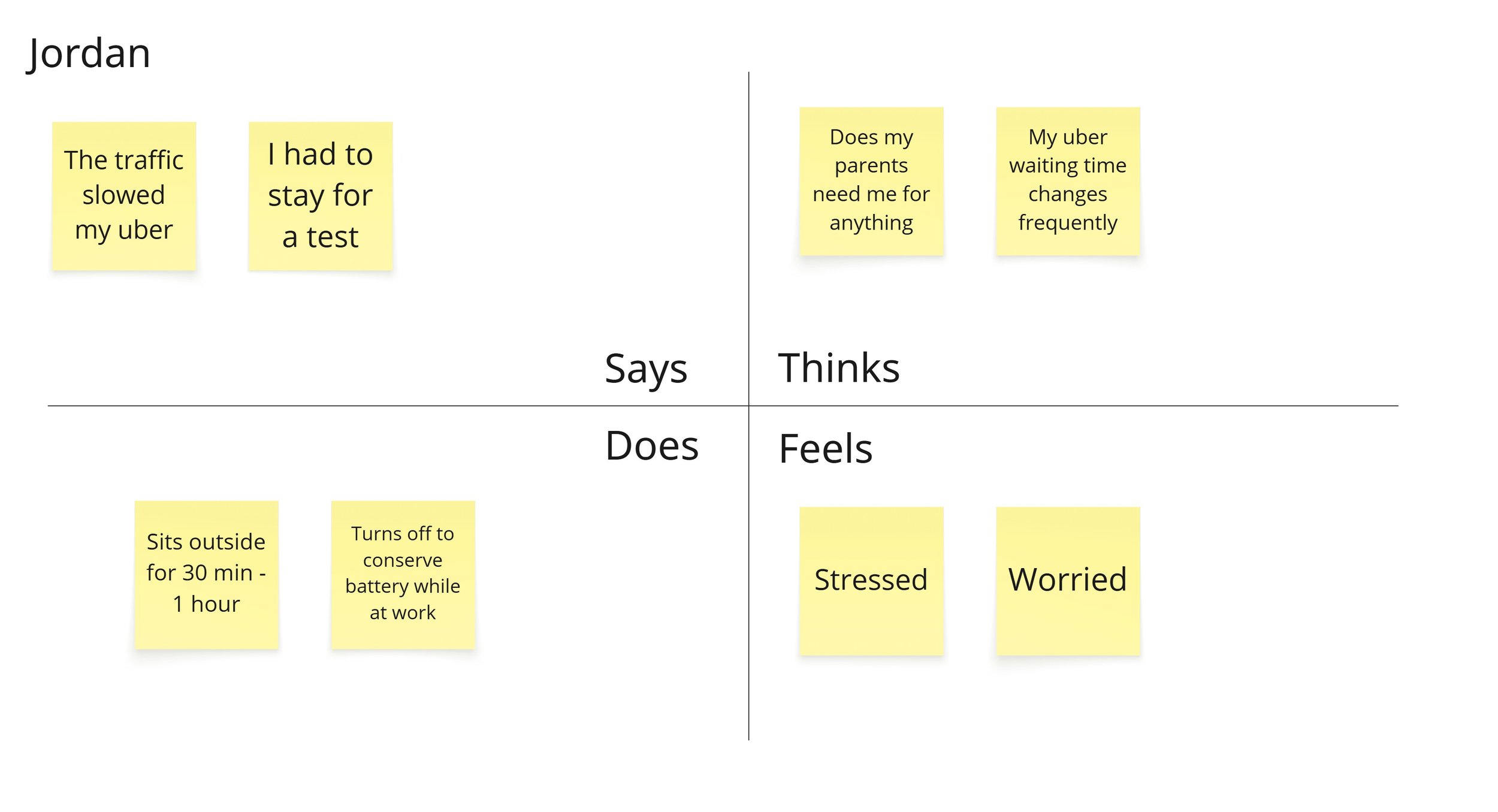
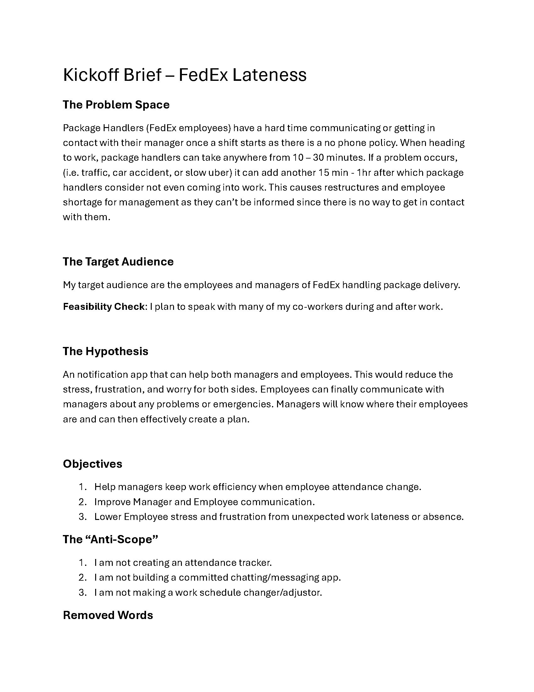
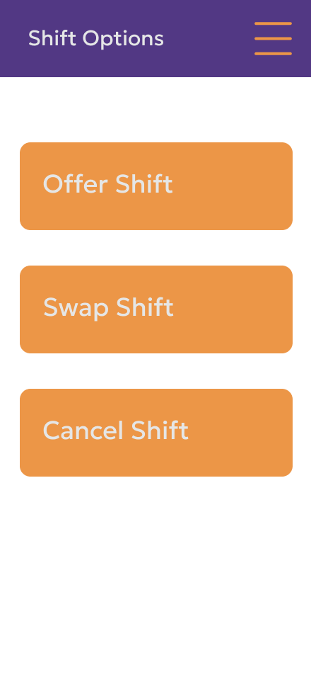
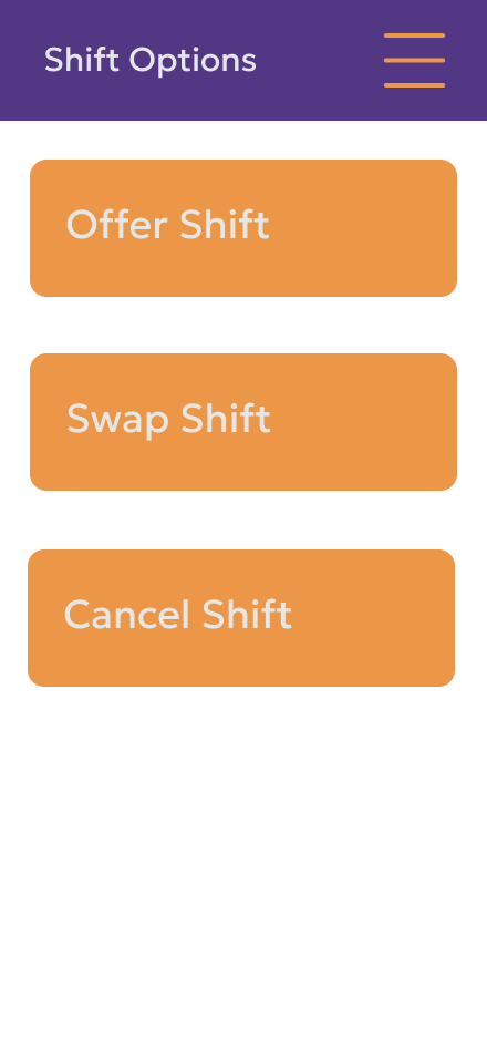
FedEx’s strict no‑phone policy creates a significant communication gap for on‑site employees. Without access to their phones, package handlers struggle to notify managers about urgent issues such as lateness, shift conflicts, or unexpected absences. At the same time, managers lack a reliable way to reach their teams or understand staffing changes in real time.
This results in a confusing, inconsistent process for requesting time off, swapping shifts, or canceling work — ultimately increasing stress for both employees and supervisors. This case study explores the opportunity to design a scheduling and communication system that reduces this friction and restores clarity.
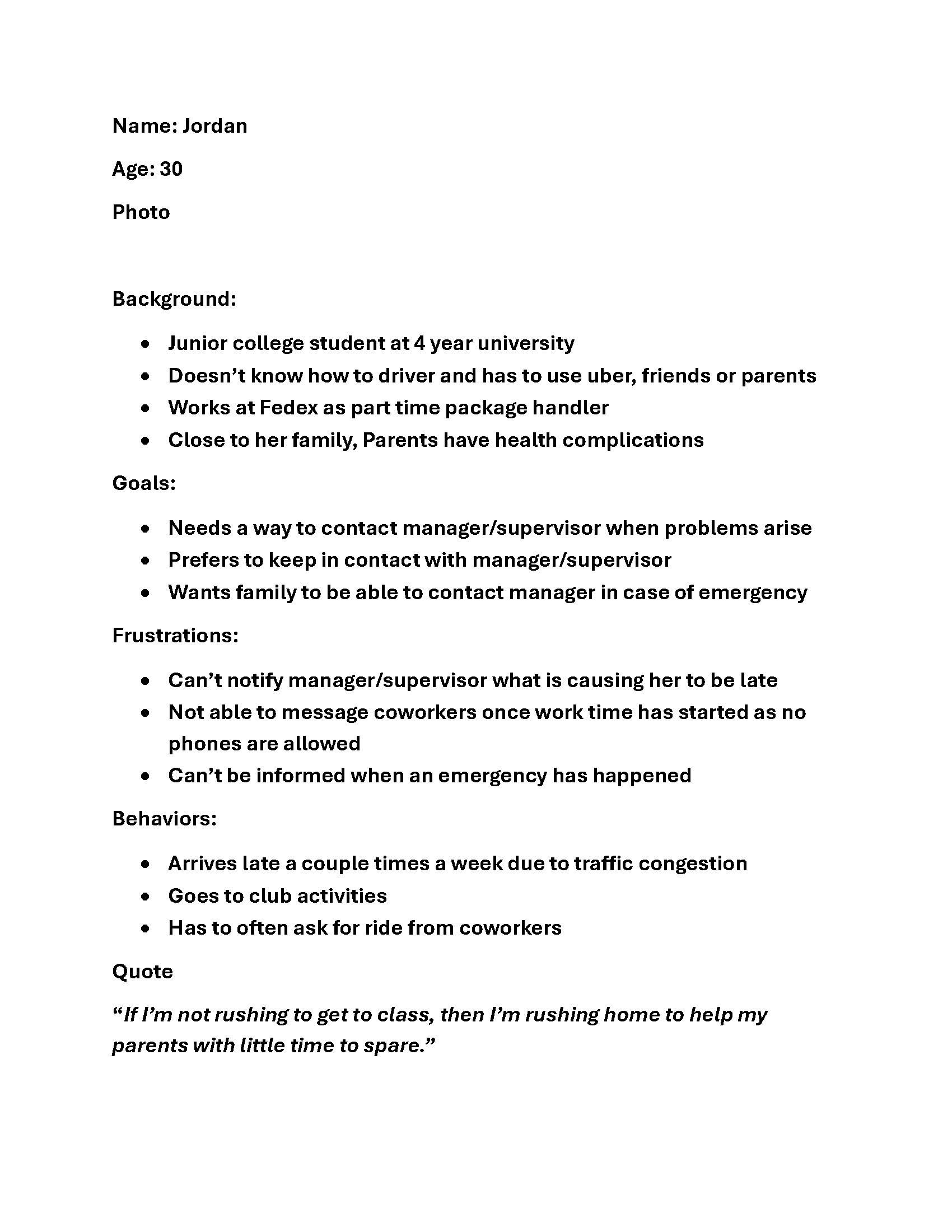
The target users include FedEx package handlers, who need a simple, fast way to manage their shifts, and managers, who require visibility into staffing changes without relying on personal phone numbers or informal communication chains. The design context is a fast‑paced, high‑volume logistics environment where workers have limited digital access and must make decisions quickly.
My role in this project included researcher, designer, and tester. I conducted user interviews, mapped pain points, and iterated on prototypes to ensure the final design aligned with real operational constraints. The core design direction centered on simplicity and familiarity: using recognizable scheduling patterns, reducing cognitive load, and giving users a sense of control while allowing the system to automate repetitive tasks.
The final solution provides a streamlined way for employees to request changes and communicate directly with managers, even within the no‑phone environment. Managers gain clearer insight into staffing needs, while employees experience less anxiety when unexpected situations arise. By reducing complexity and improving communication flow, the design supports a more predictable, less stressful workplace for everyone involved.
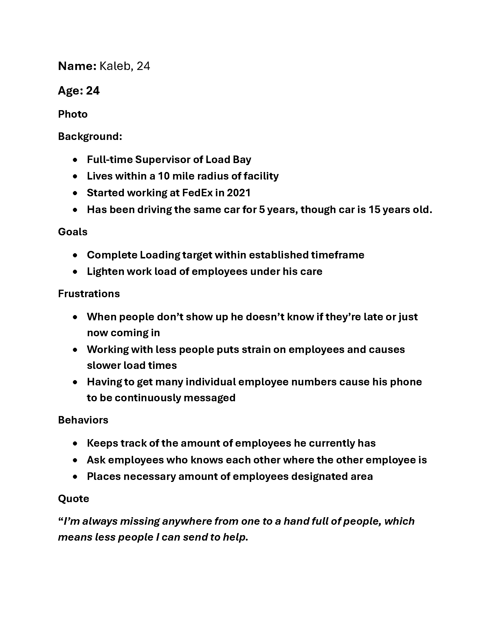
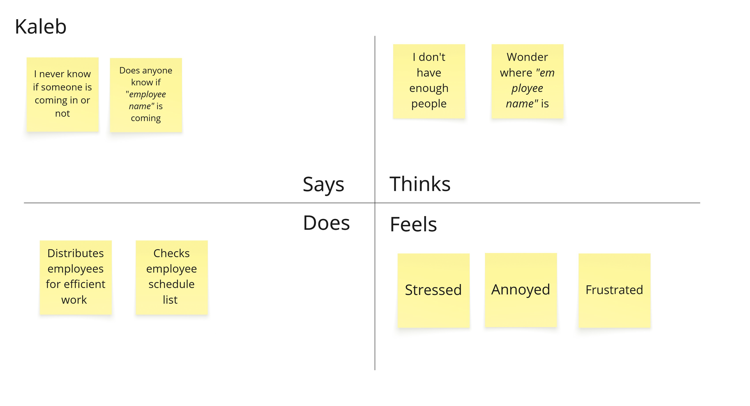
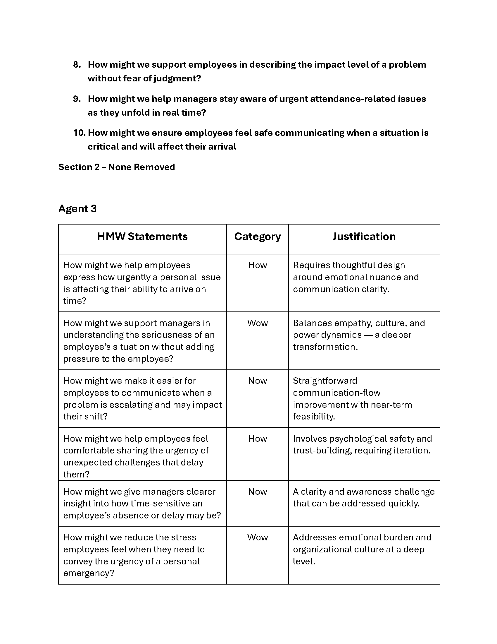
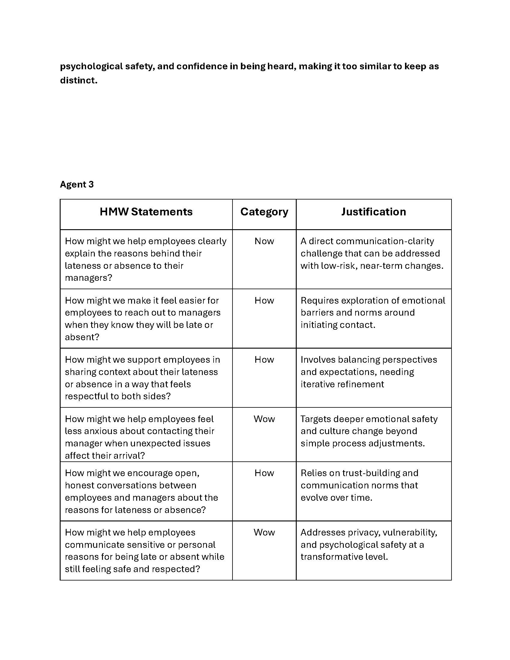
The type of persona was a factor that couldn’t be forgotten, as it was important to remember all the groups that would be affected, as more than just the regular employee would interact with this design.
Problem Framing
When starting it was clear who this was meant to be for and what it had to achieve above anything. Any direction I took when going through this process I made sure that it, at the very least, didn’t deviate from what the core problem was.

Structure, Ideation, Early Decision-making
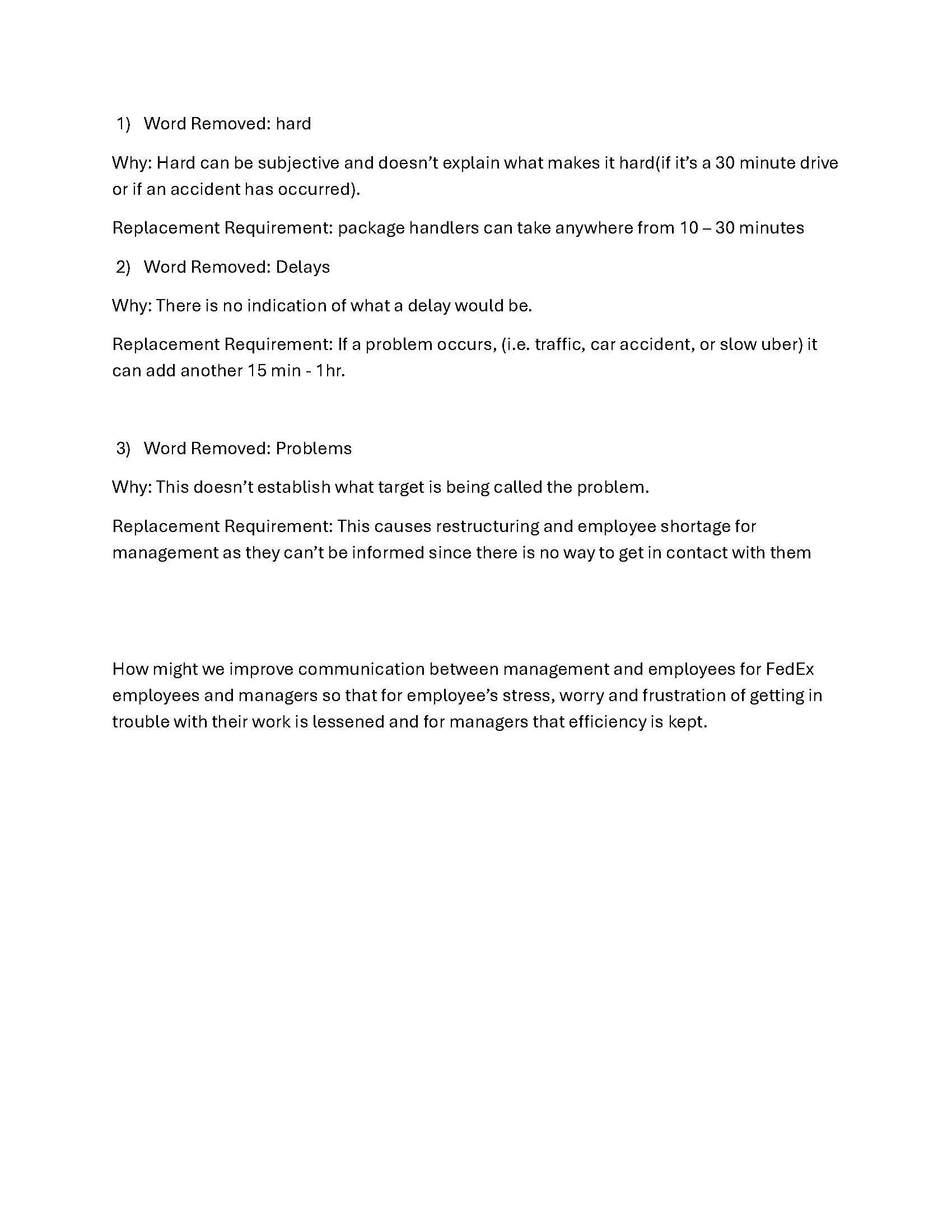
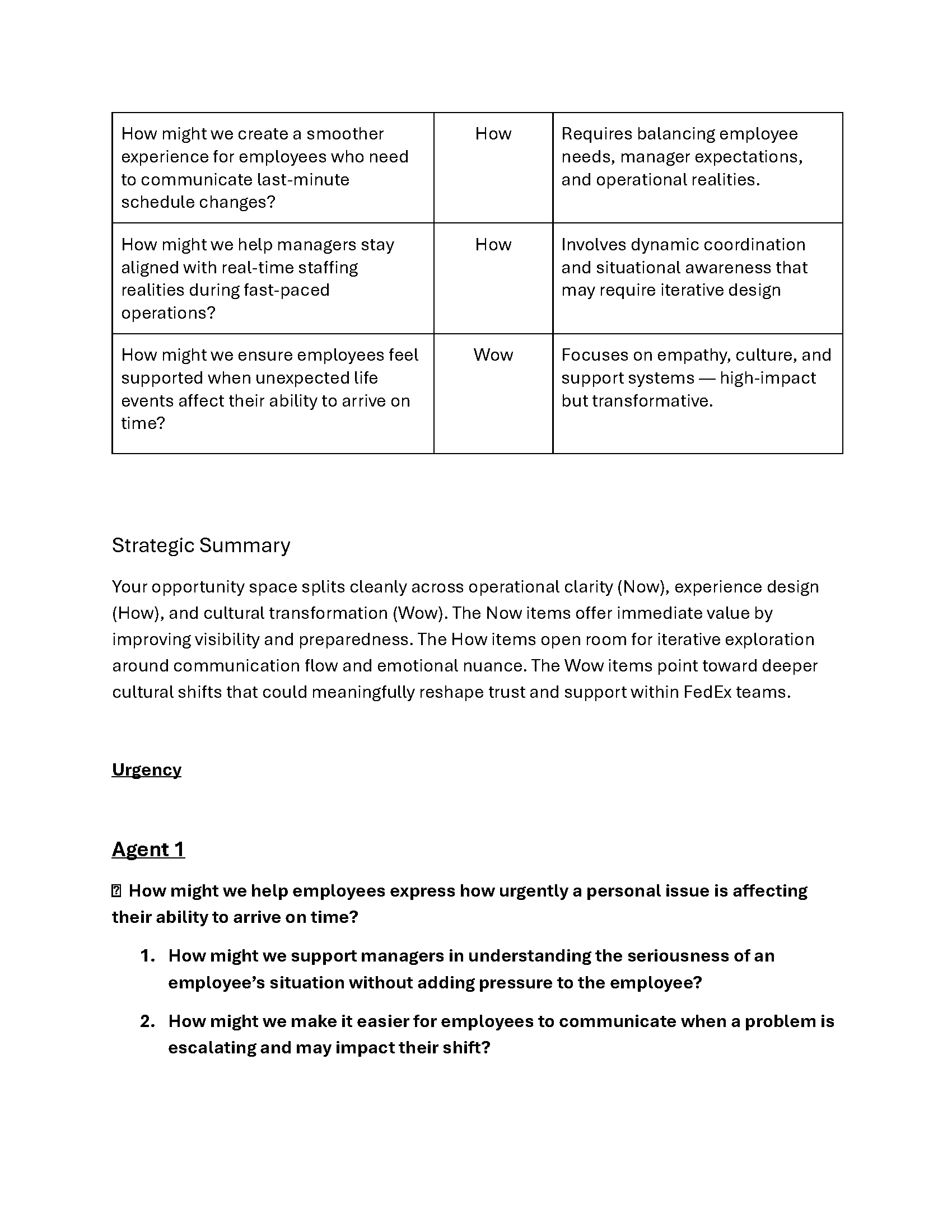
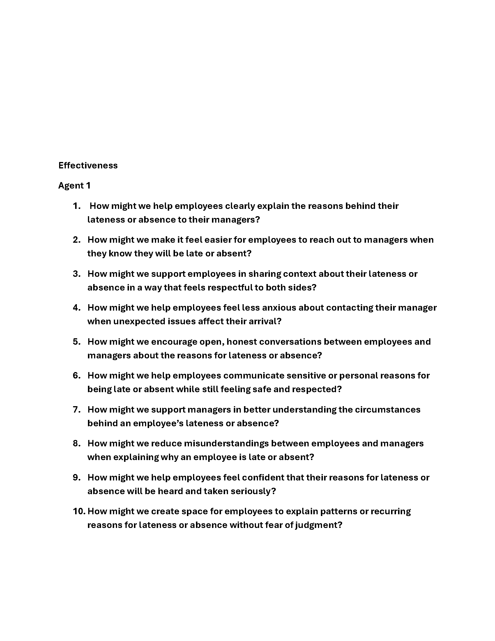
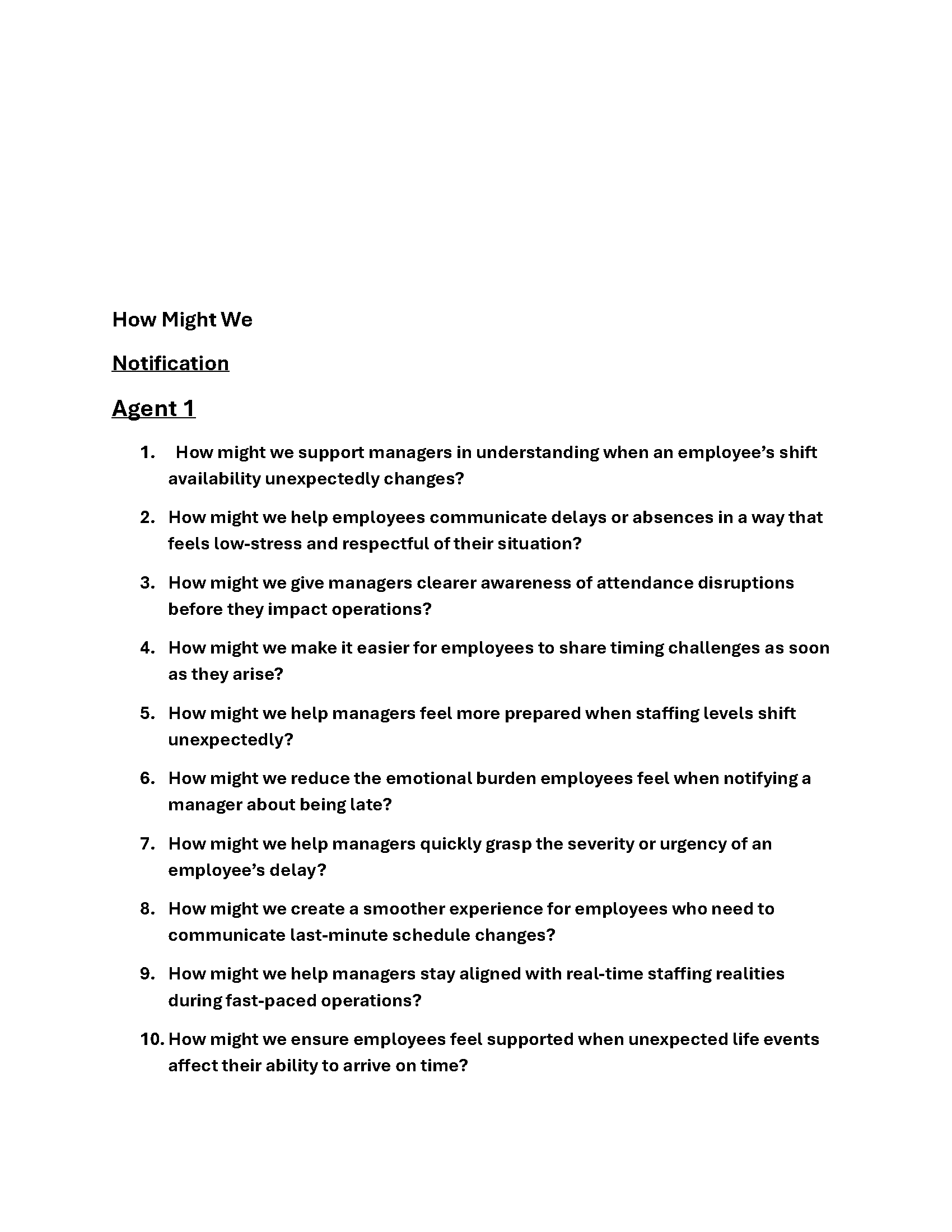
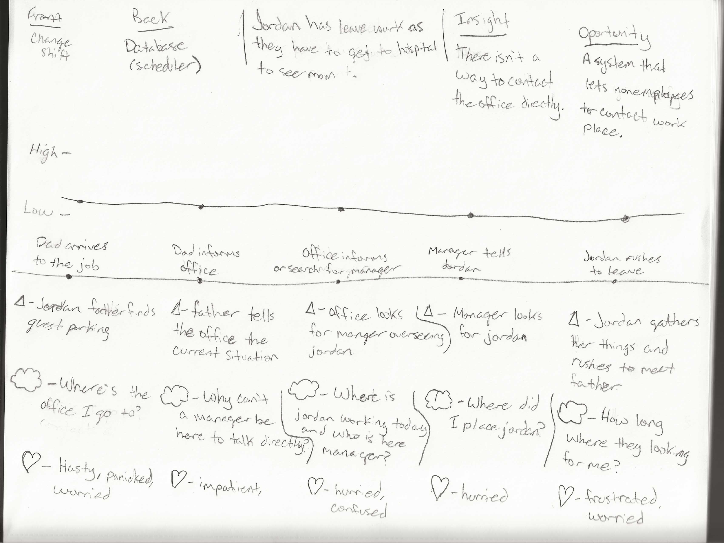
Many structures and ideas came from diving into what was causing the communication problem and what areas it was lacking.
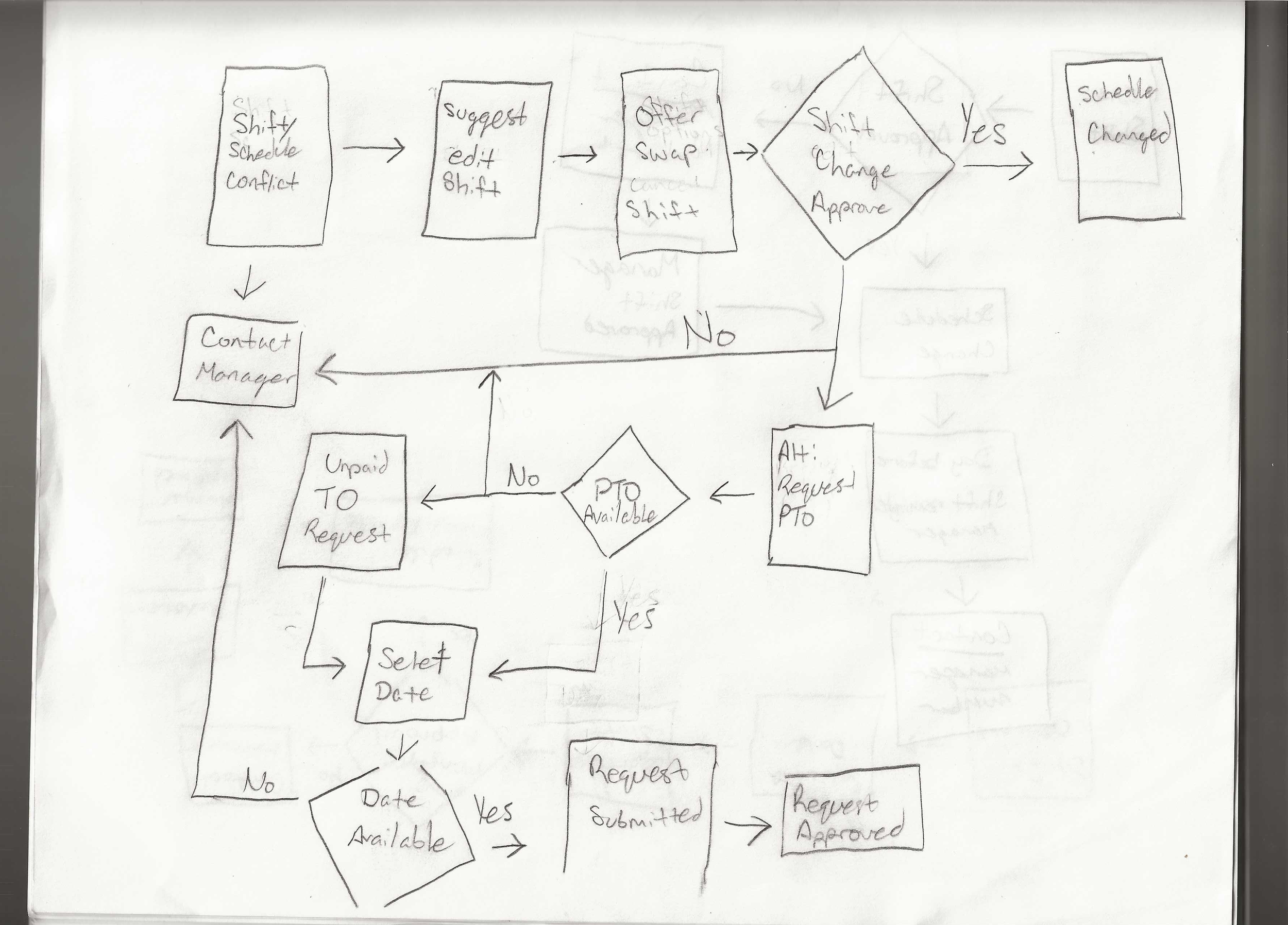
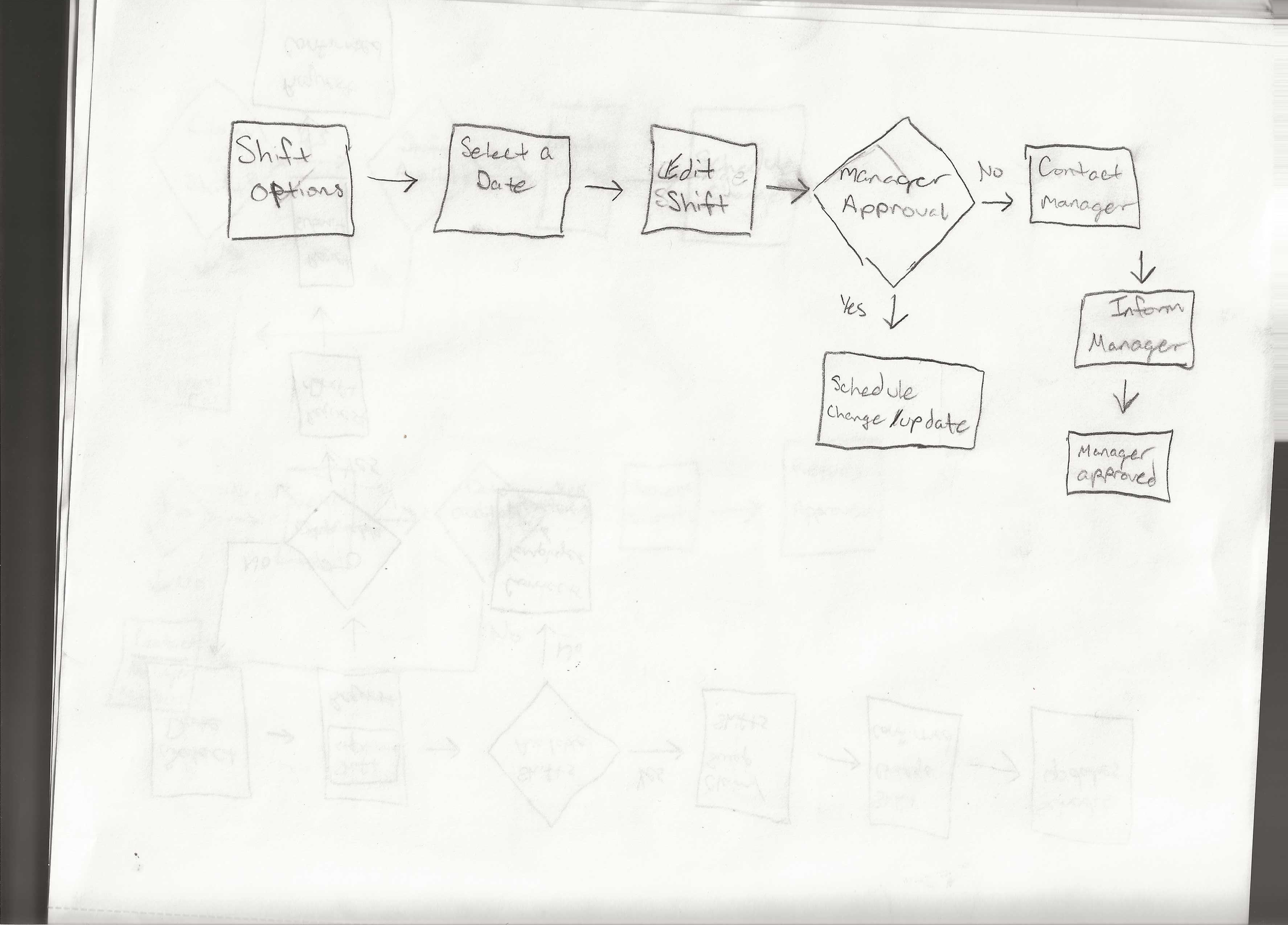
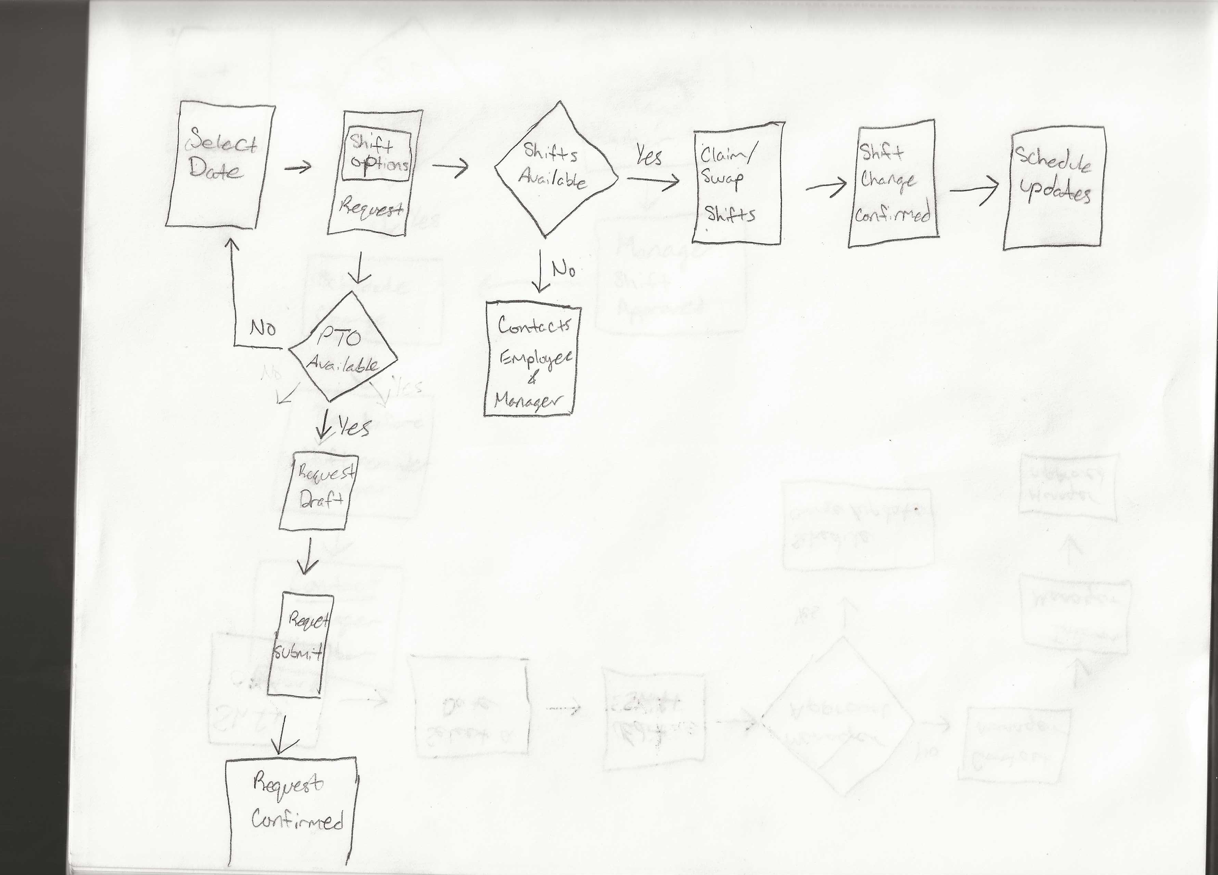
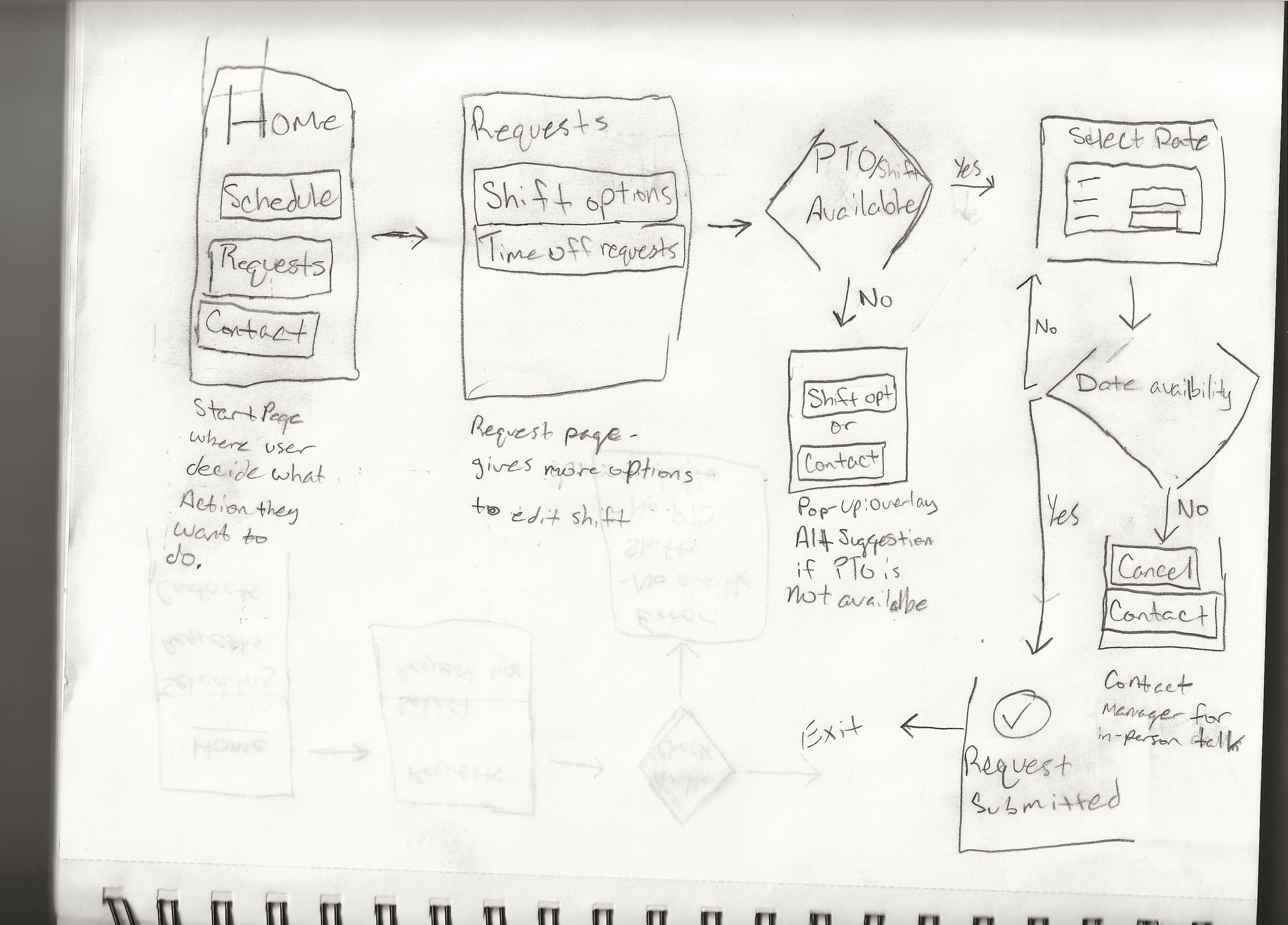
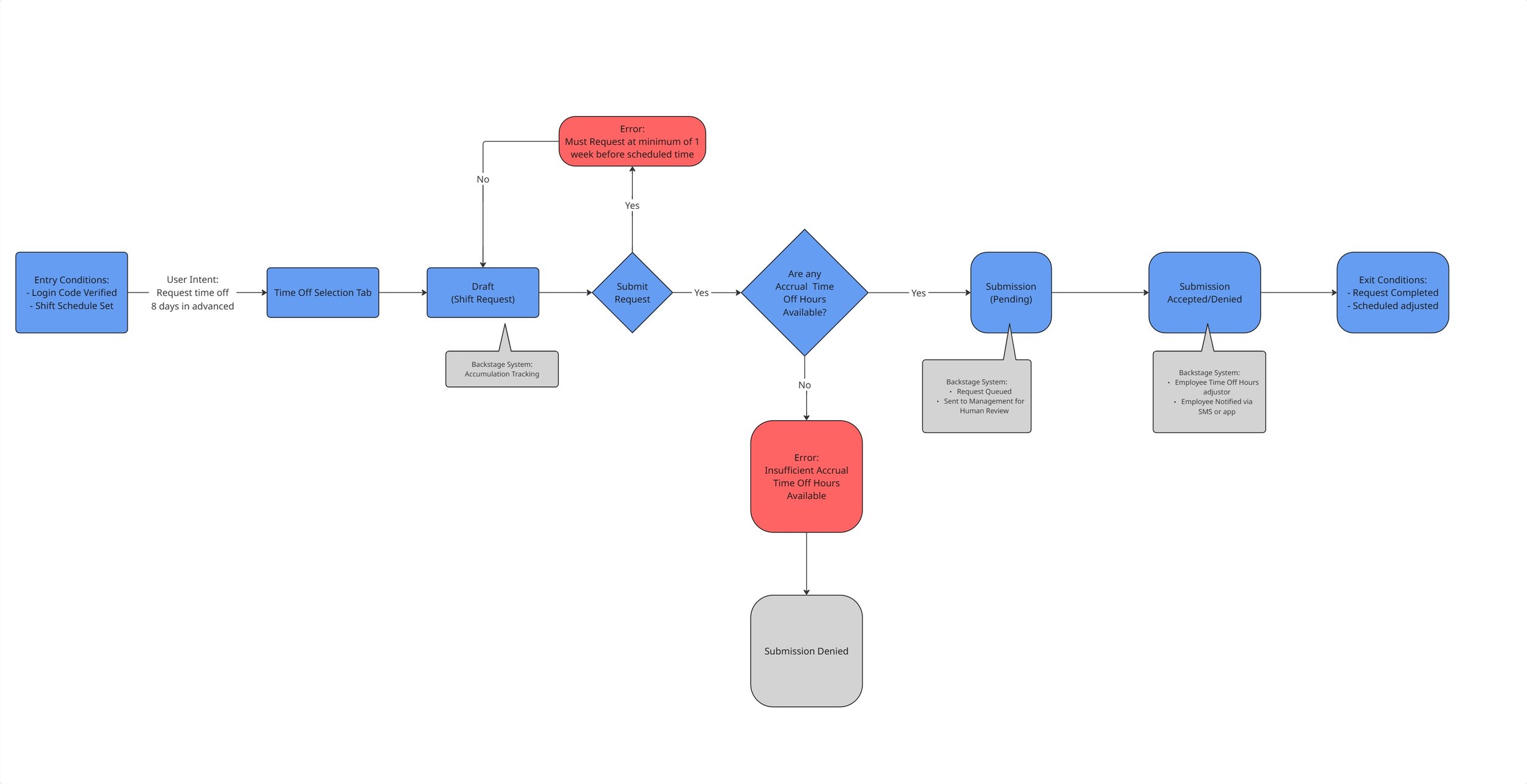
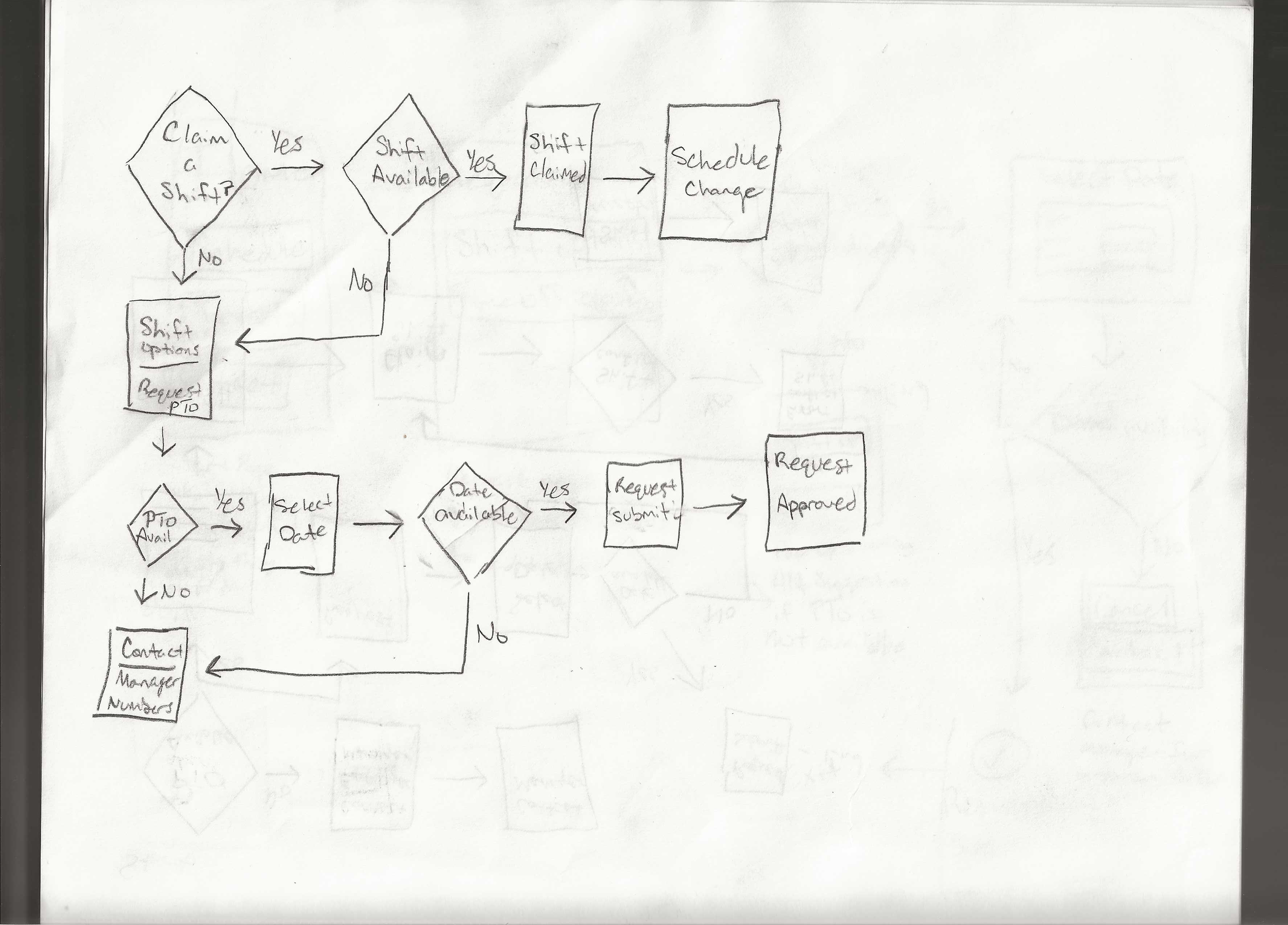
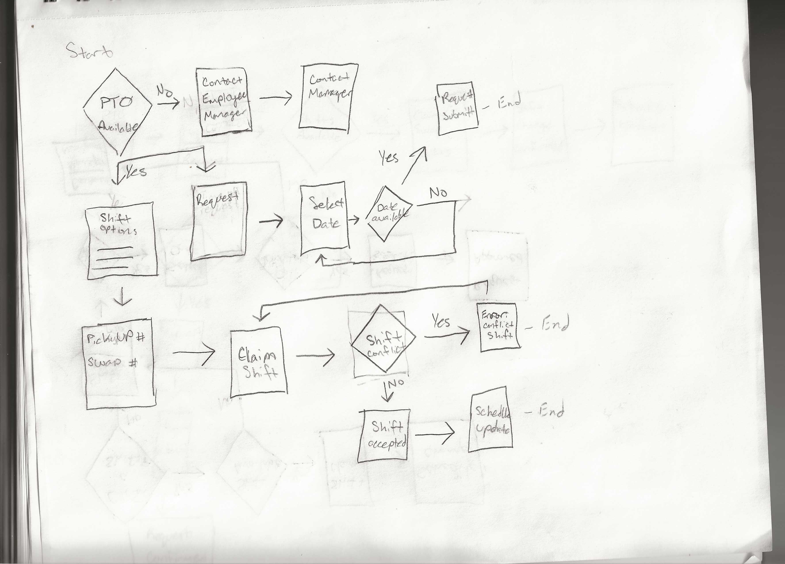
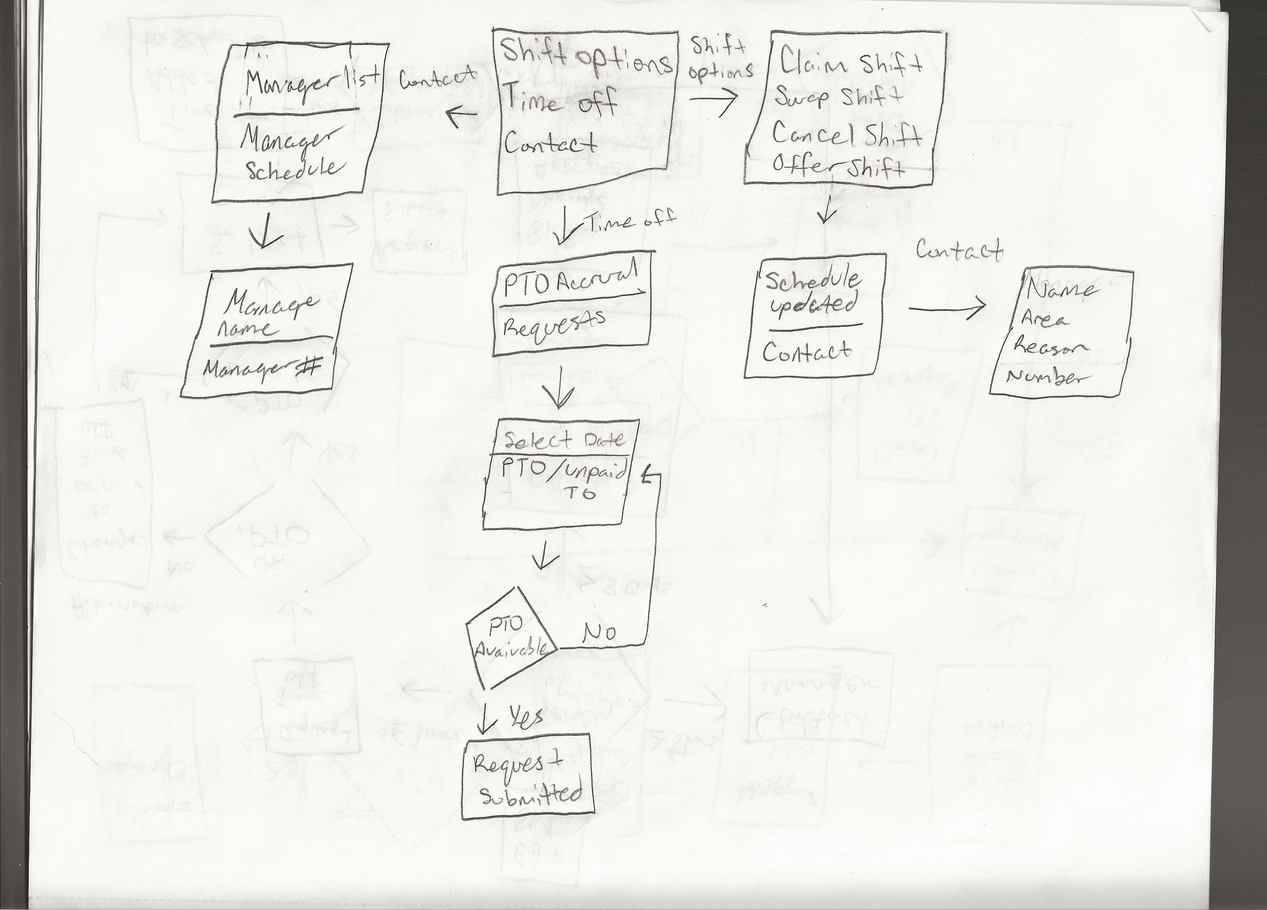
Paths and User flows were changed or omitted as the understanding became clearer on what the system needs to do or be.
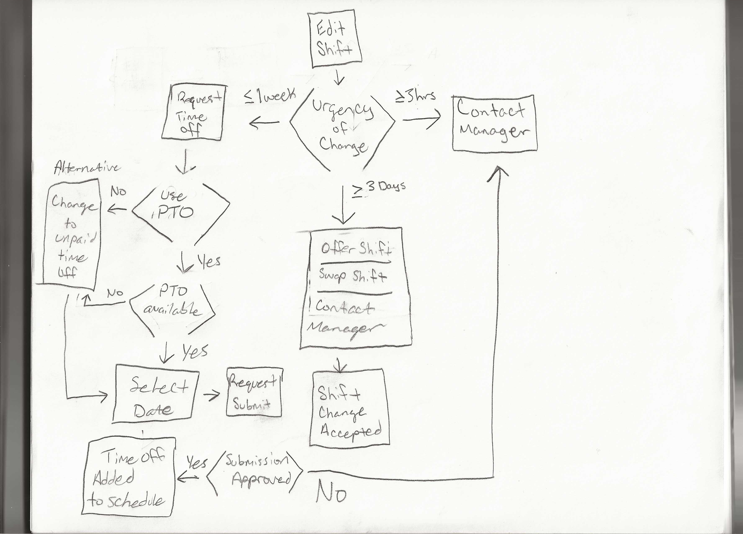
Certain sketches and concepts that proved to be useful were the ones that had the user as the primary controller, but the system also assisted the user, making it easier for them.
Originally, two ideas were being experimented with. The idea of having the system do most of the work, or the idea of letting the user be in control of everything.
Early testing of the flow and the possible directions showed some initial benefits, but overall, they didn’t stay because they each would have 2 or more sections that would be too complex to fit with the goal of having a simple theme.
Design Development
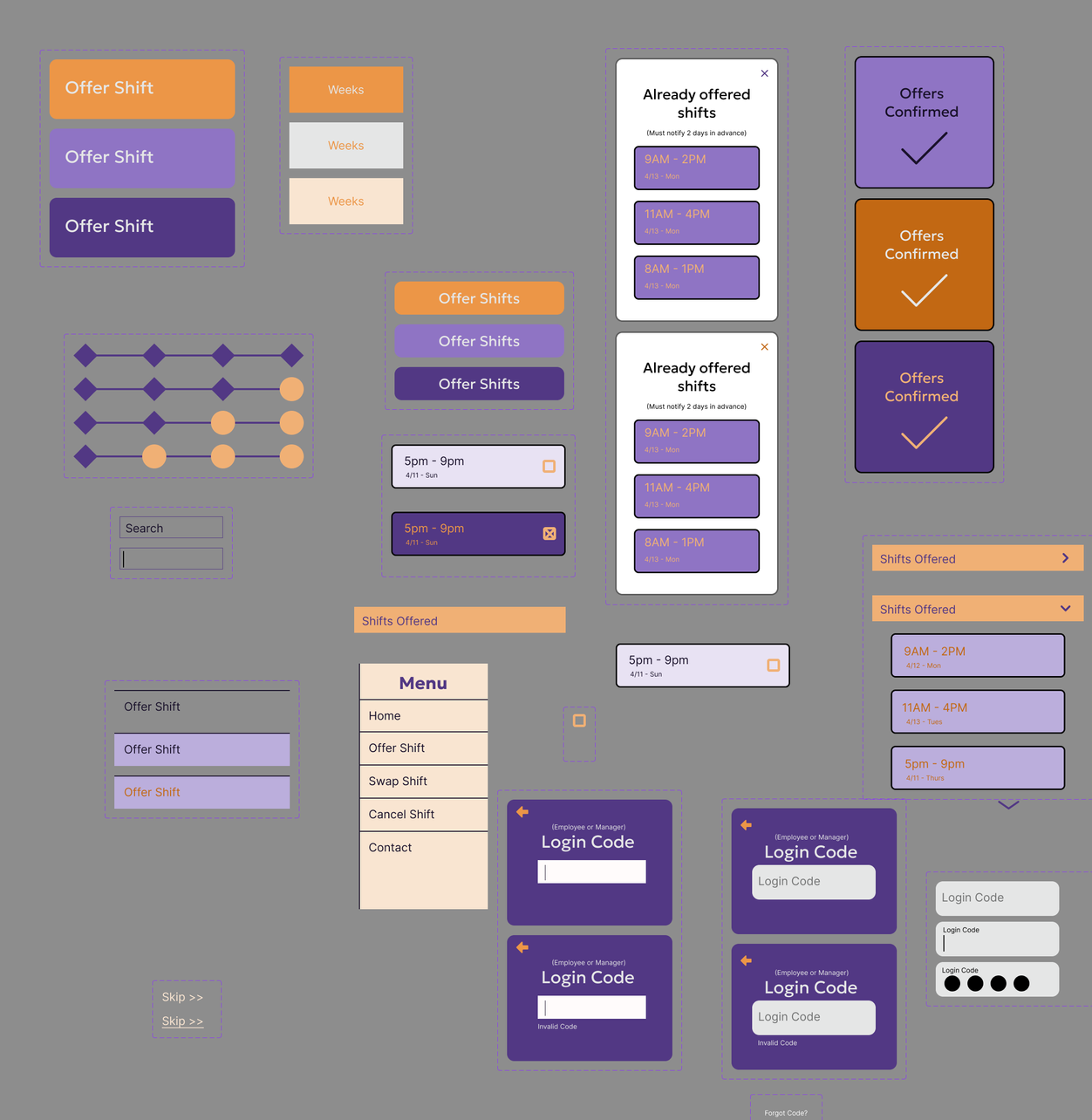
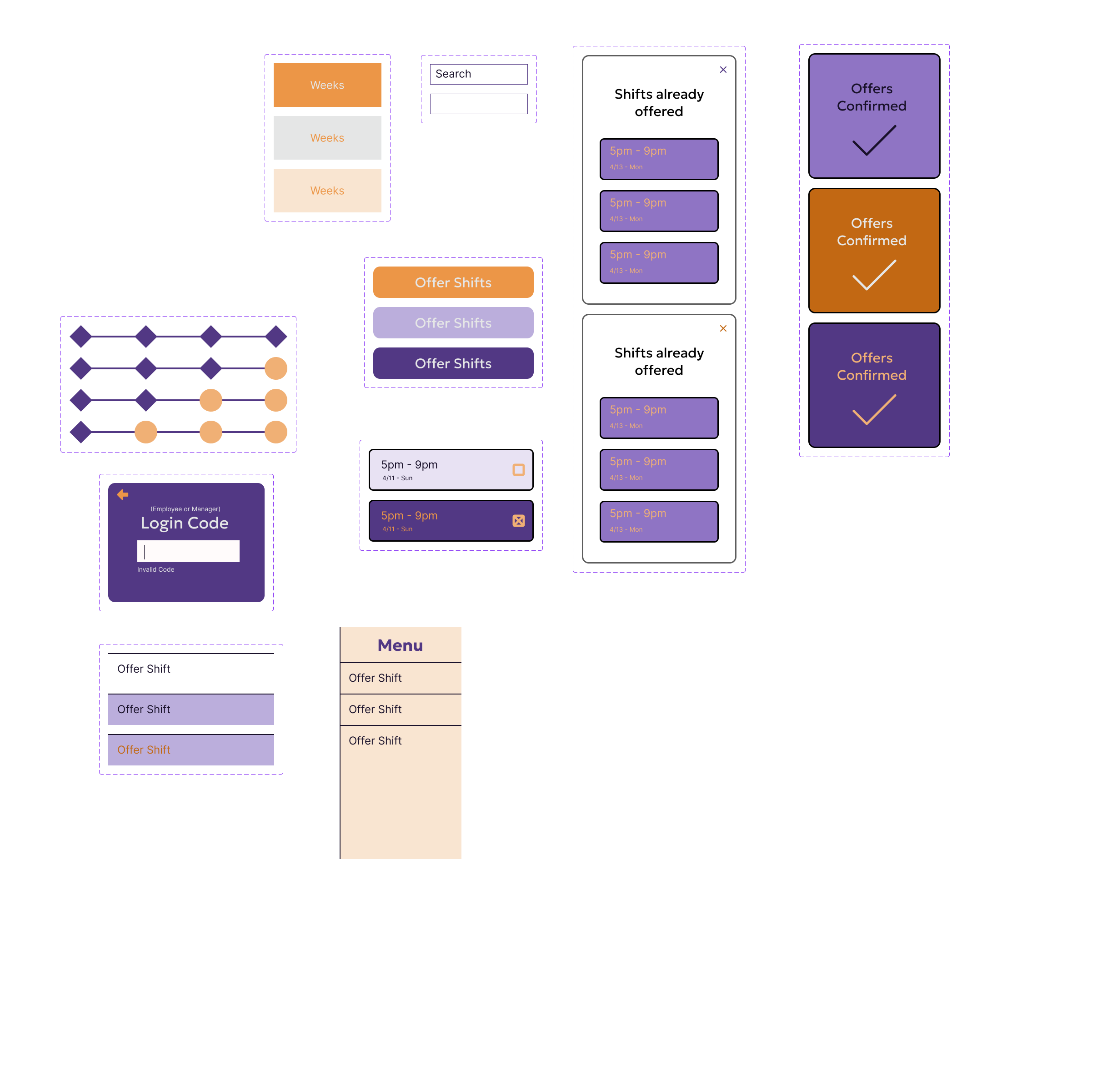
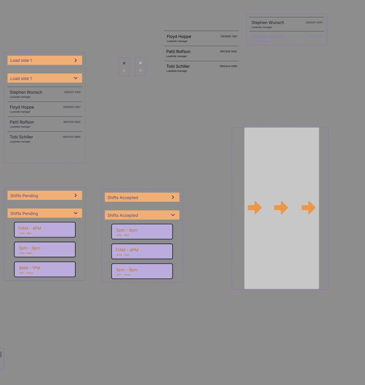
Early Wireframes kept in mind that when fully protoyped, it would represent user controlled, but also system-assisted.
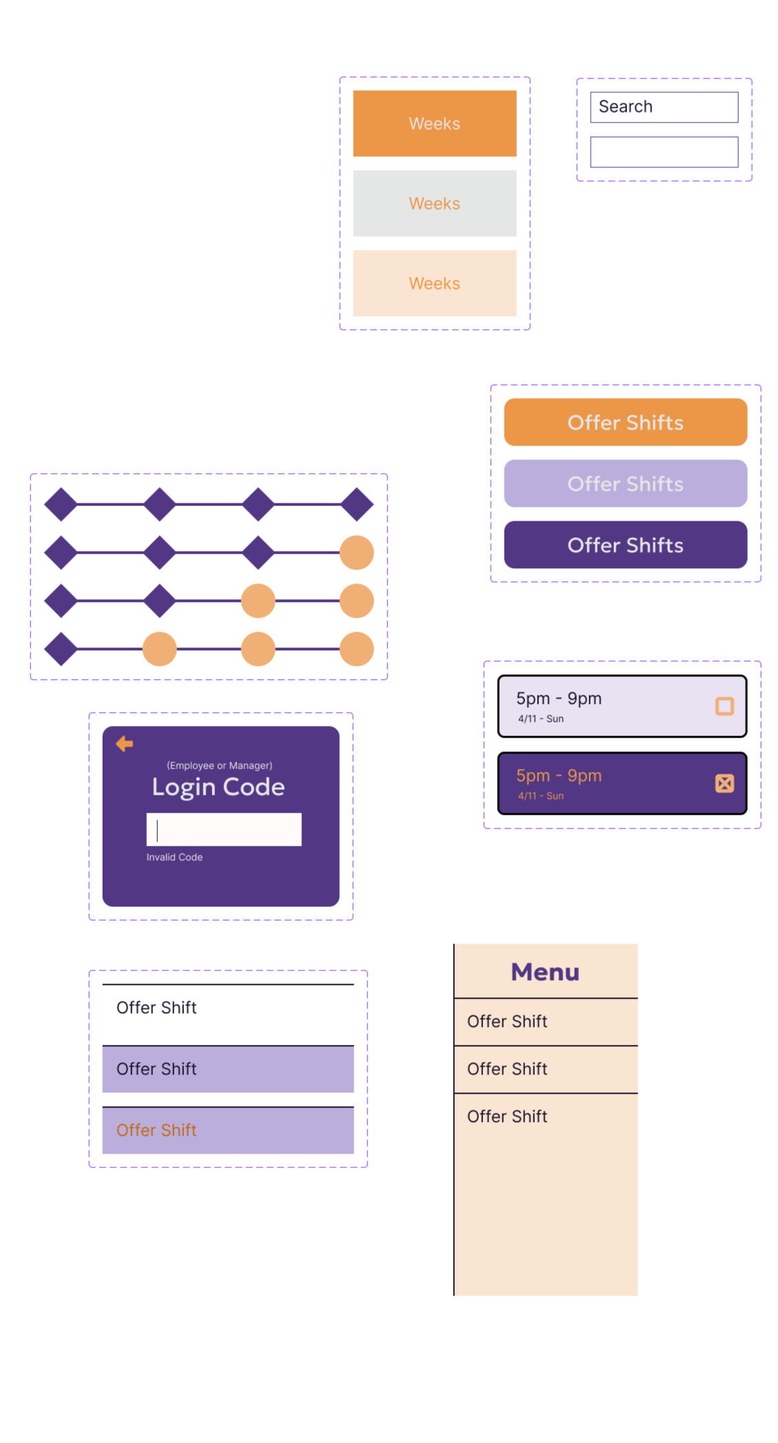

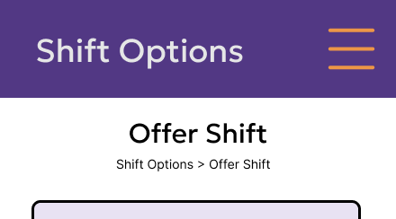
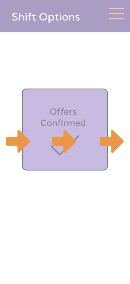
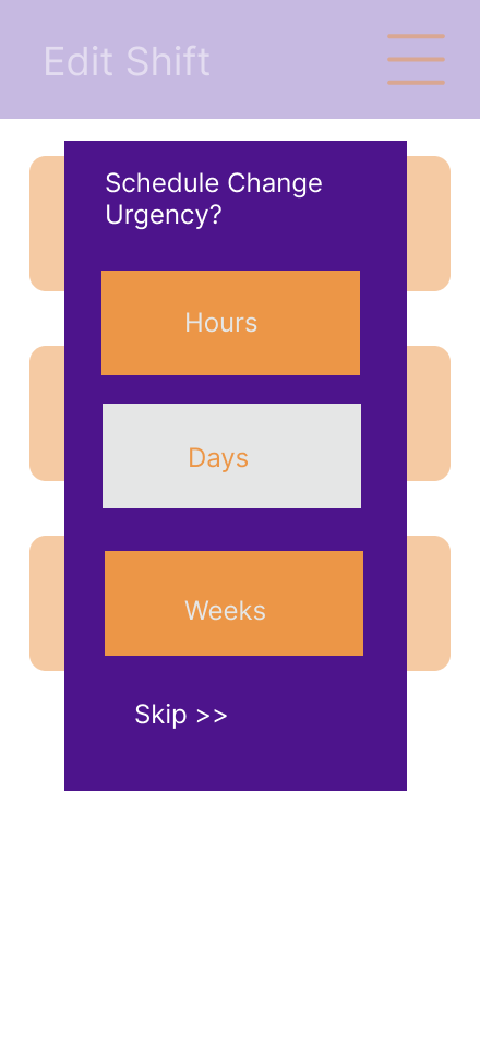
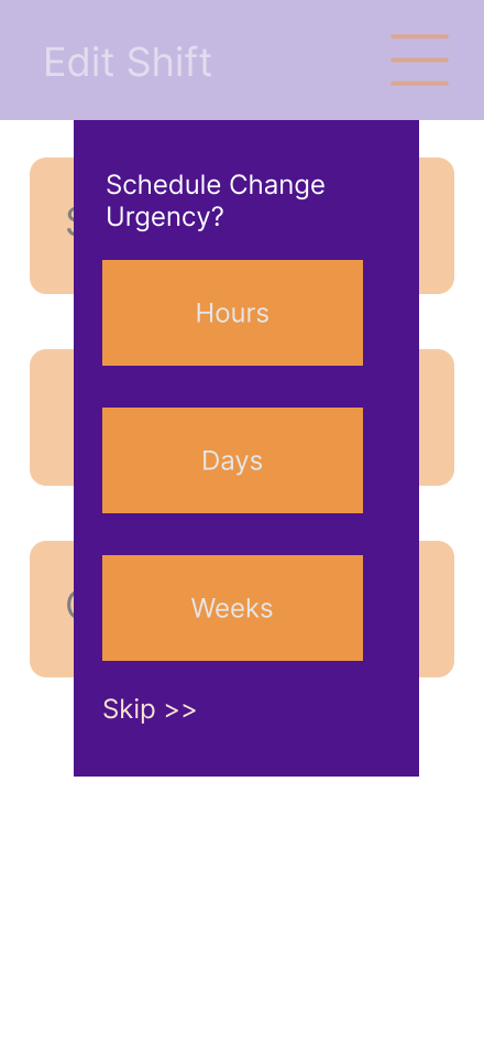
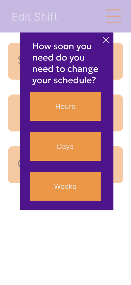
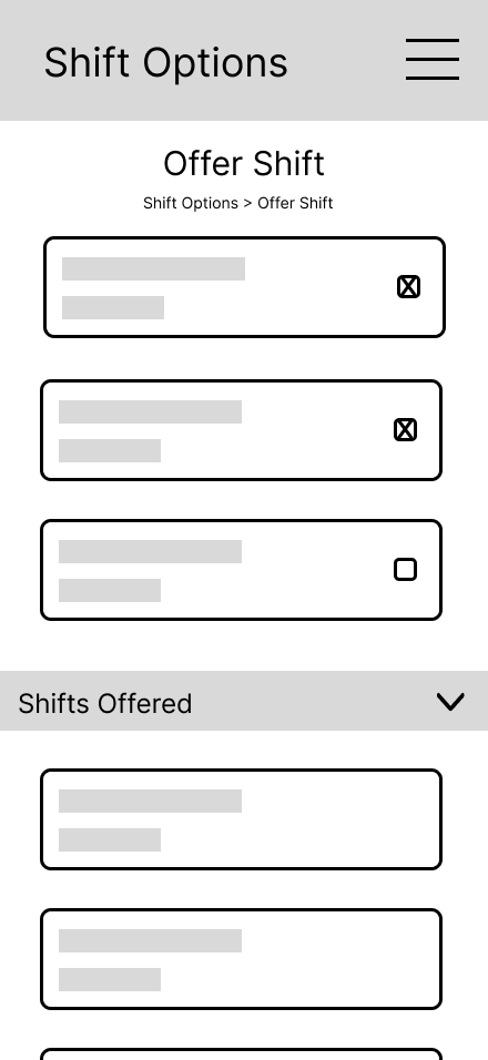
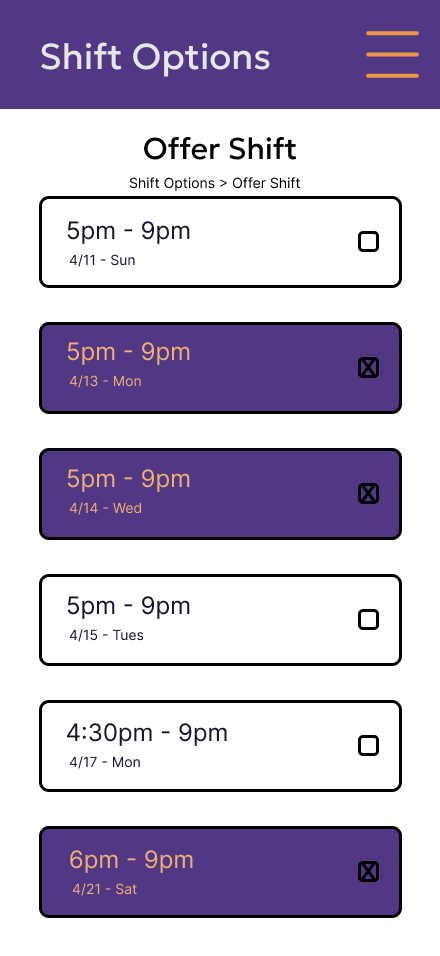
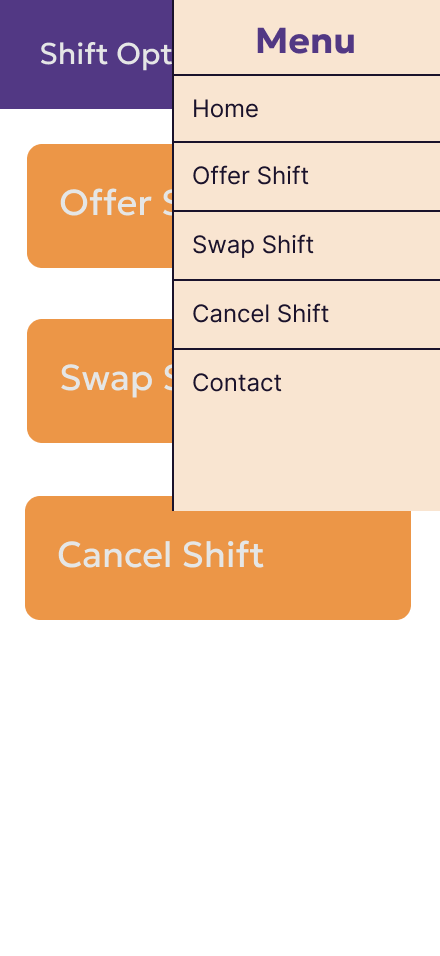
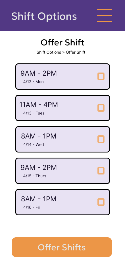
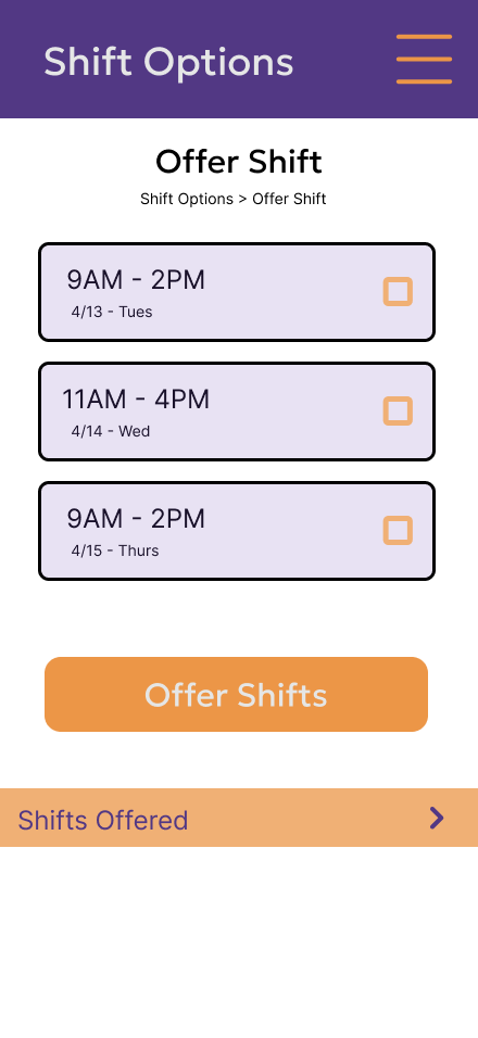
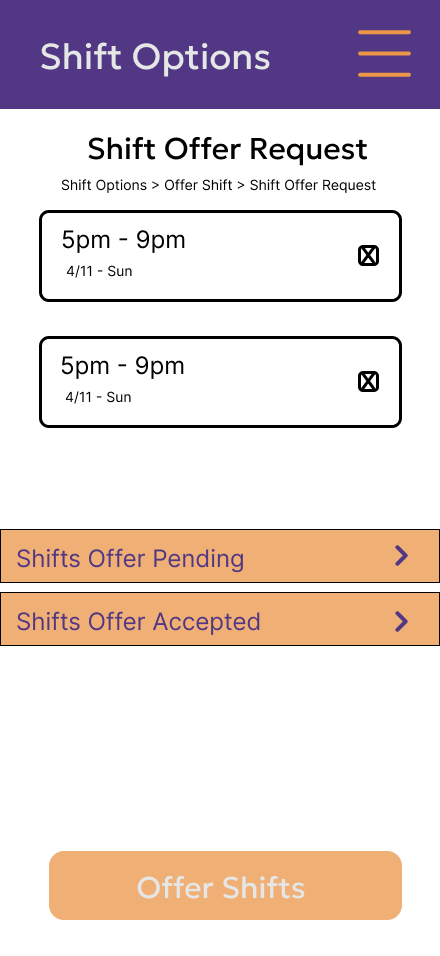
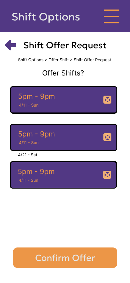
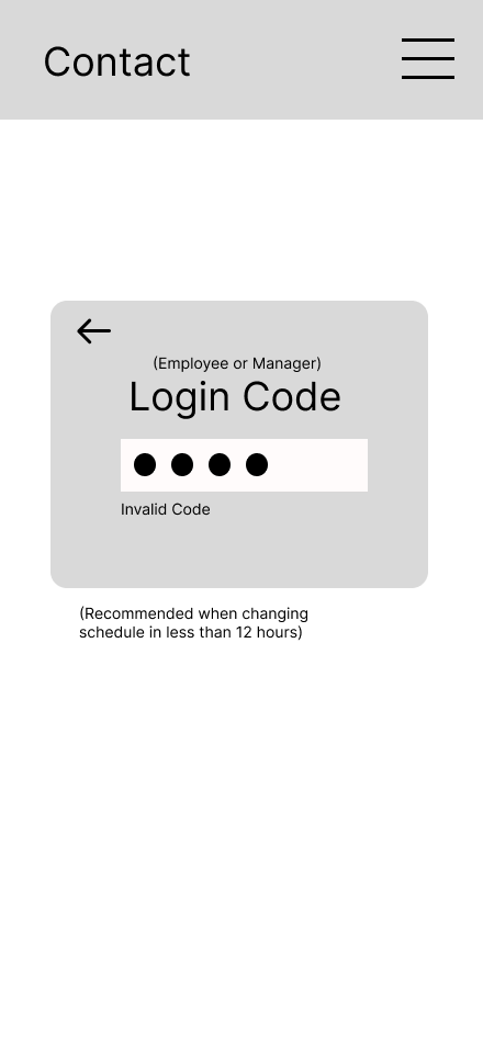
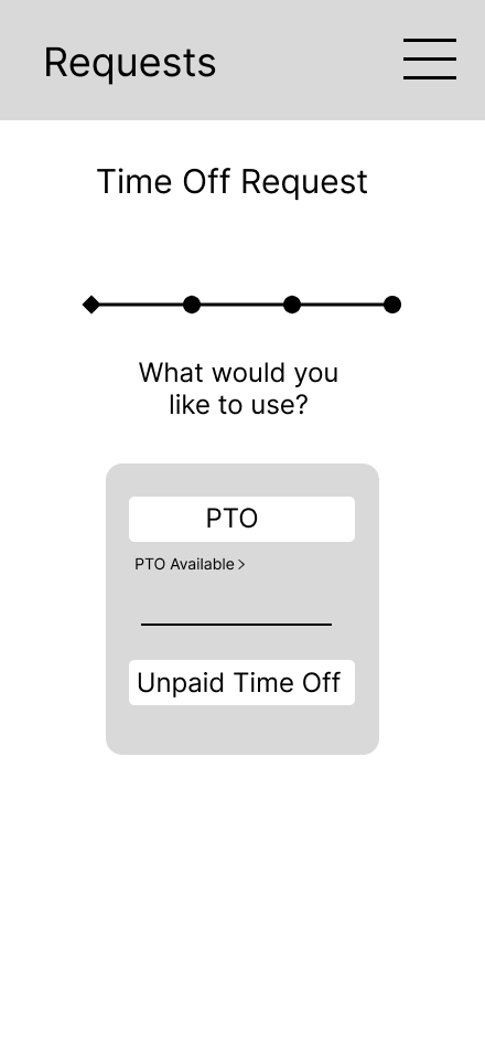
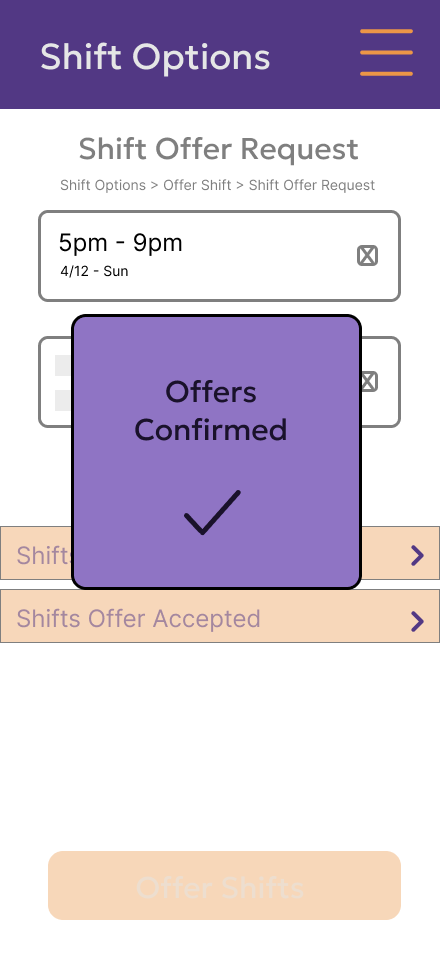
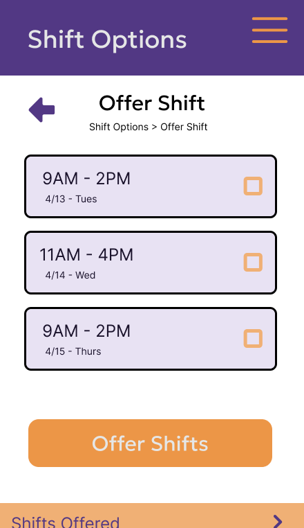
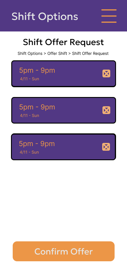
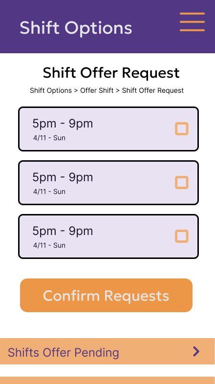
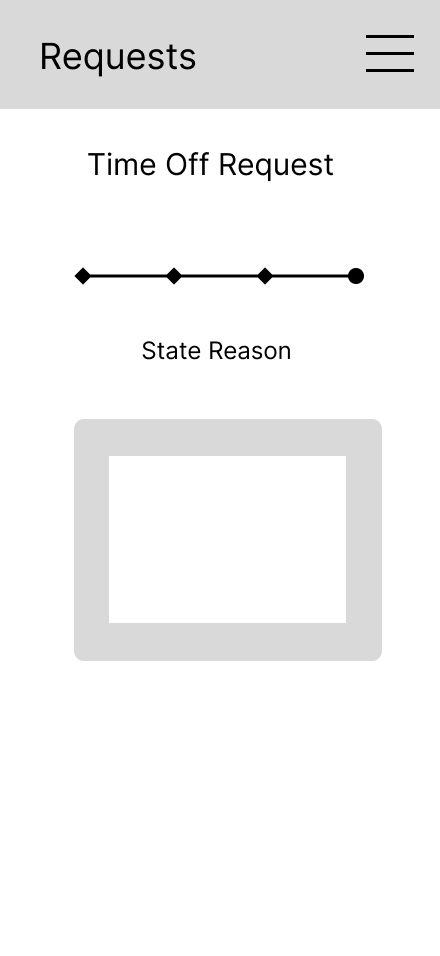
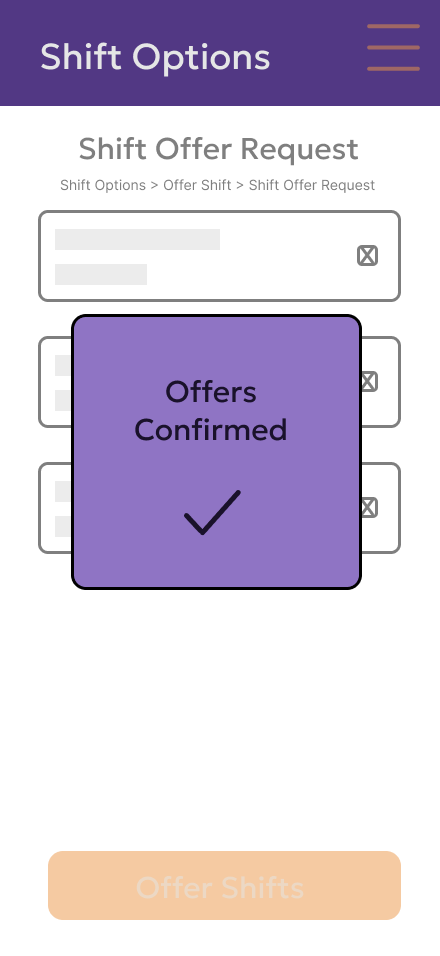
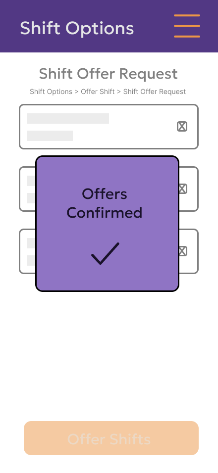
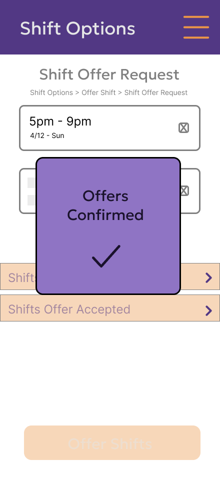
Improvement: During the construction was a change in how the section location was shown. From a progress bar to a breadcrumb component, while small in physical size, this helps reassert to the user where exactly they are and how deep they’ve gone.
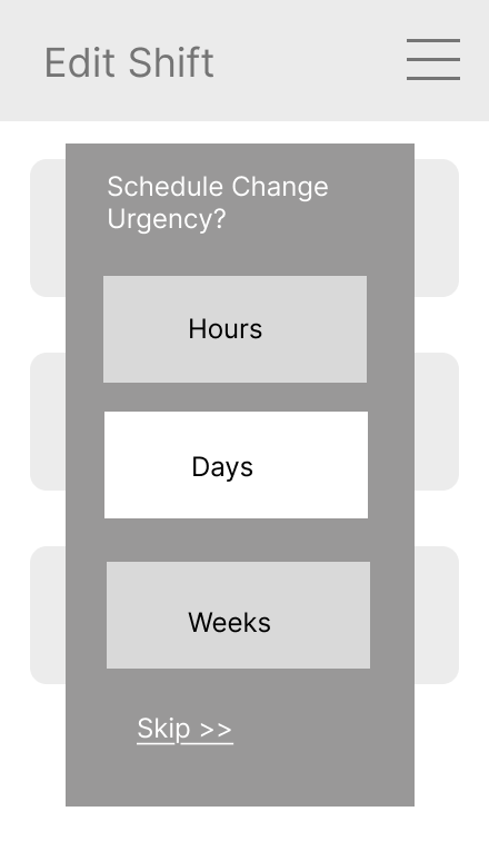
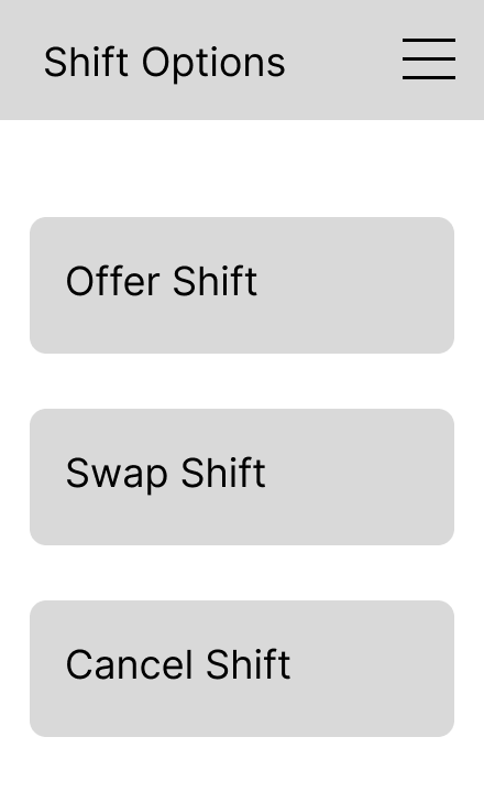
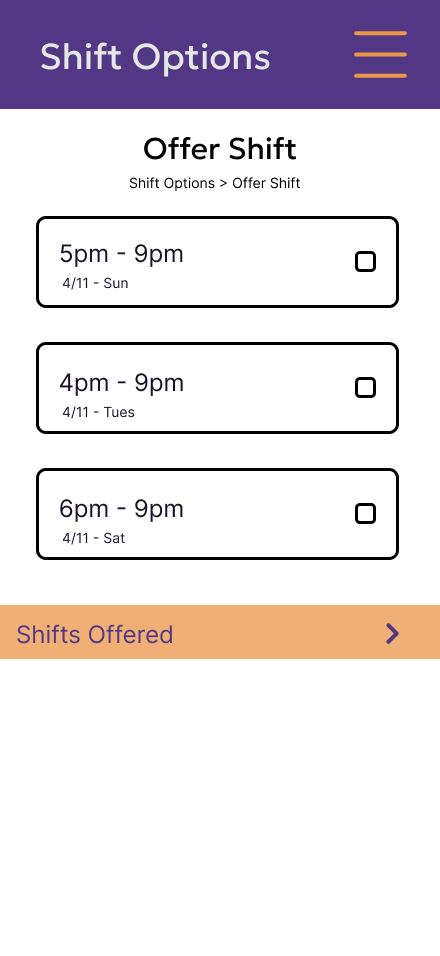
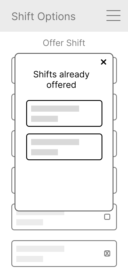
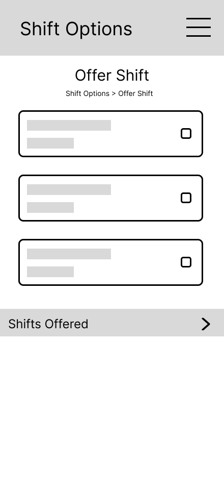
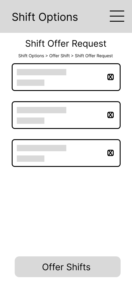
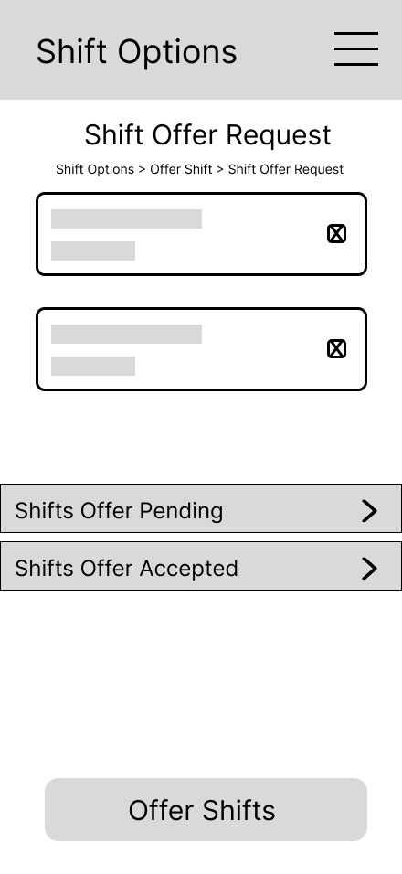
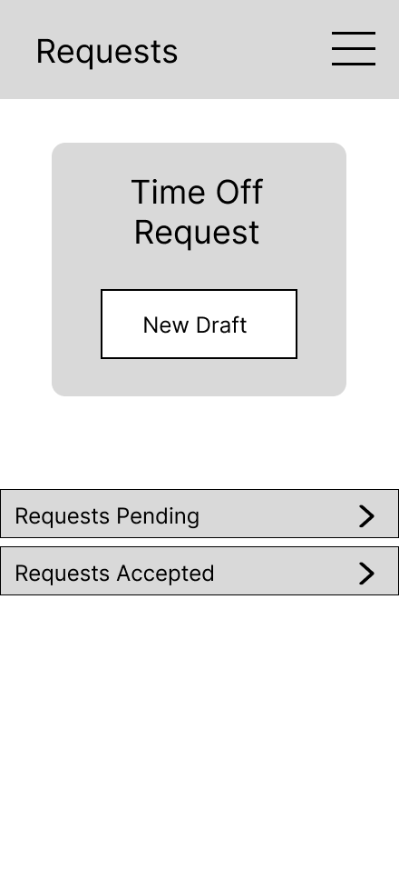
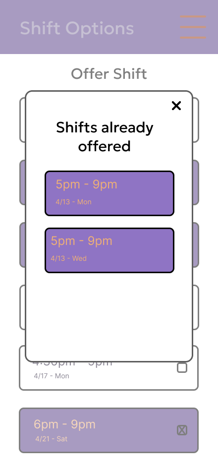
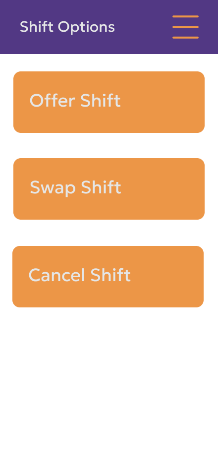
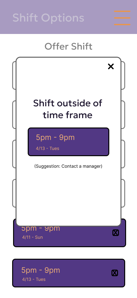
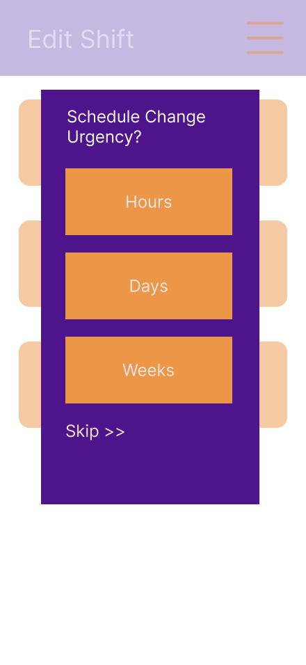
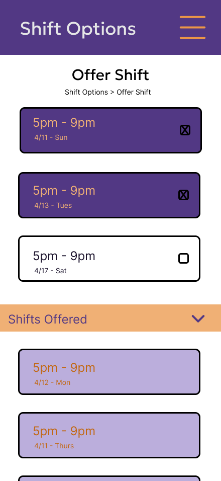
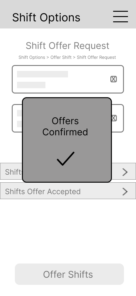
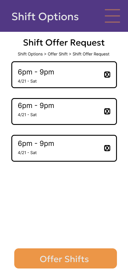
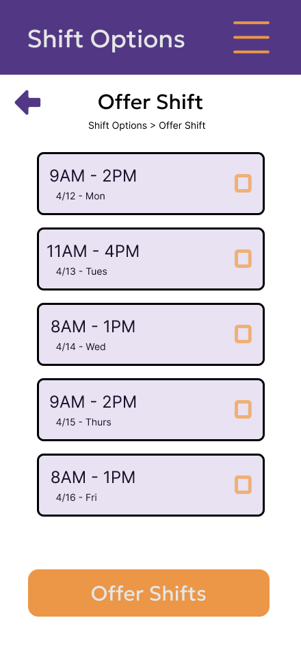
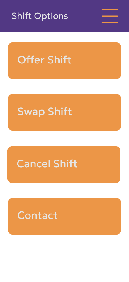
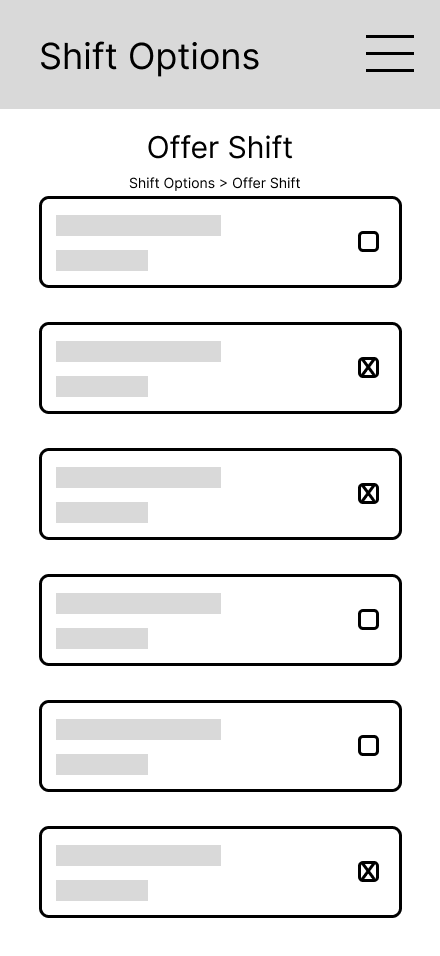
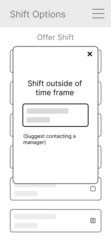
An improvement was the addition of a shift offered dropdown being added to the offer shifts screen.
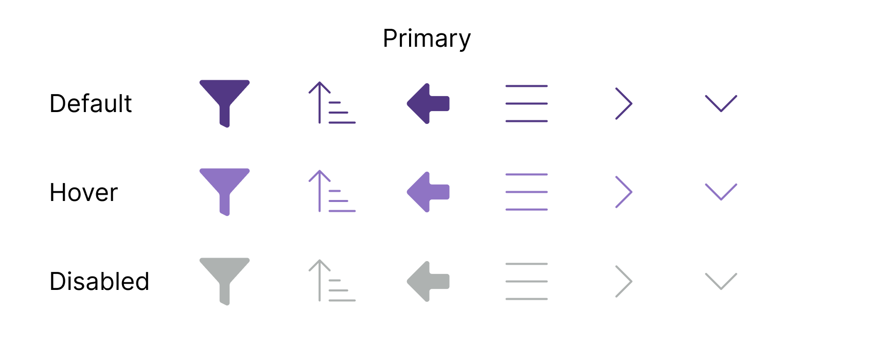
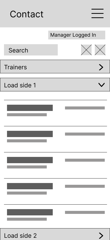
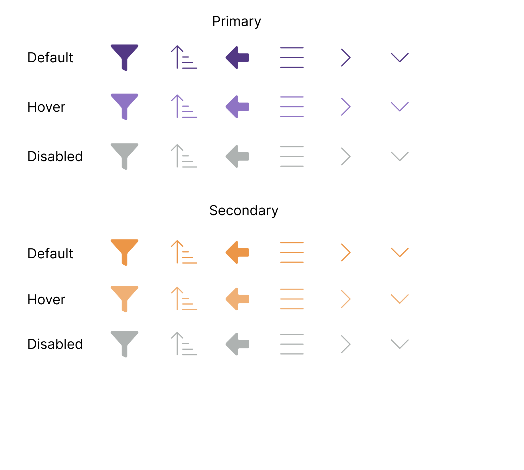
Early Components and Wireframes made sure that the layout and design were kept simple and recognizable.

Iterations and Outcomes
I used 4 different evaluation methods to help decide what needed to be improved. I used Heuristic(used twice), Cognitive Walk-Through, Think Aloud, and 1st Click testing to see the strong and weak areas of my design.
Heuristic tested if the components used would be easily recognizable or understood. Cognitive Walk-Through tested whether it was easy to grasp what each button would do and if the wording made sense. Think Aloud tested if the design layout and word choice aligned with the expected user thought process. Lastly, 1st Click tested the confidence that the user would have in clicking the button they desired.


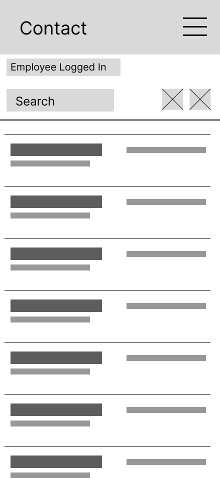
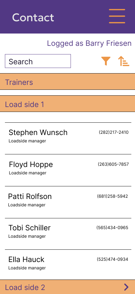
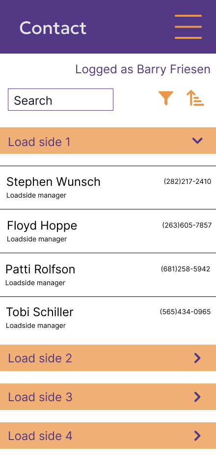
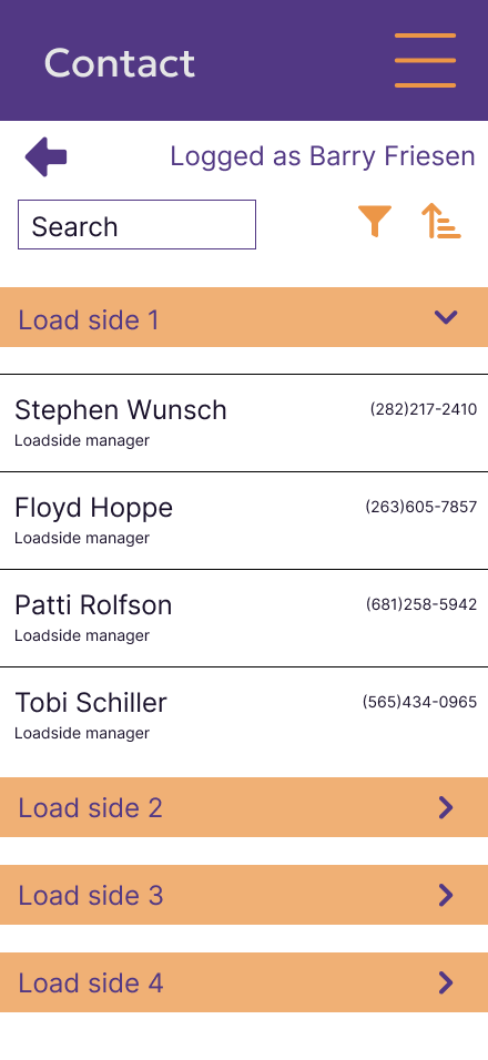
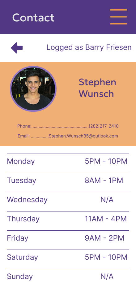
A profile page was added to give more details. The initial design was only the name and phone number. But something that was found during testing was that the user wouldn’t know which manager was working or what their availability was.

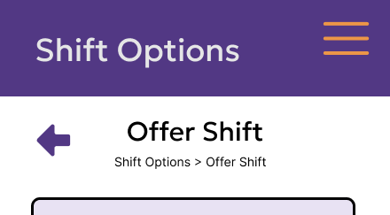
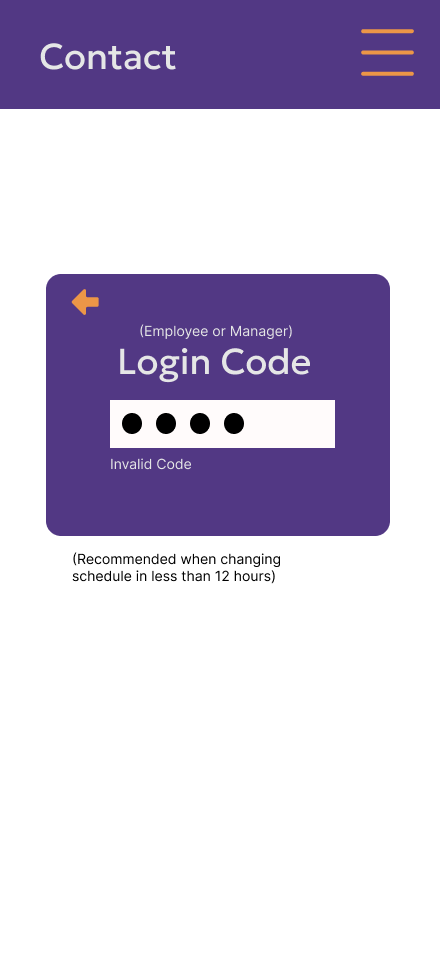
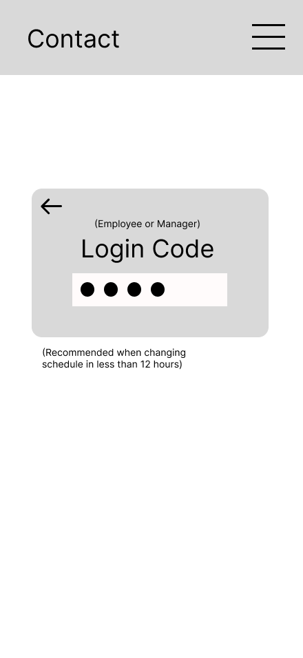
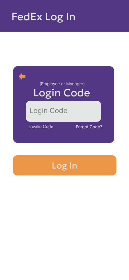
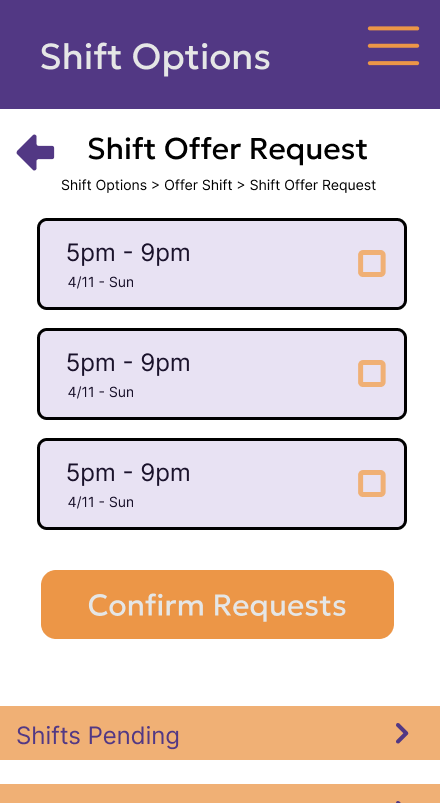
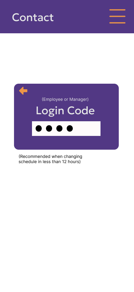
For navigation, a back arrow was added during the process of canceling/giving up a shift. This was a need, as tests showed users liked the ability to go back regardless of the reason.
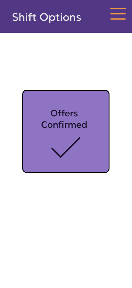
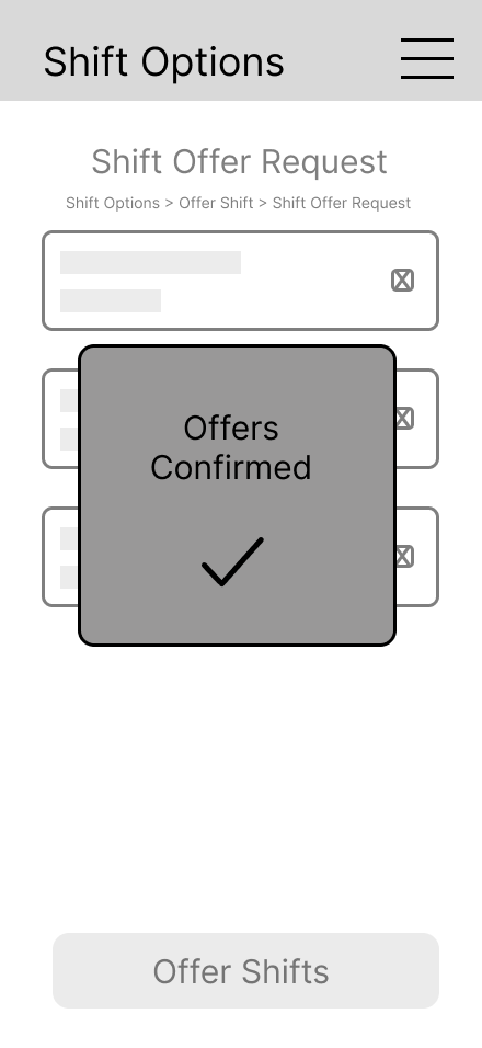
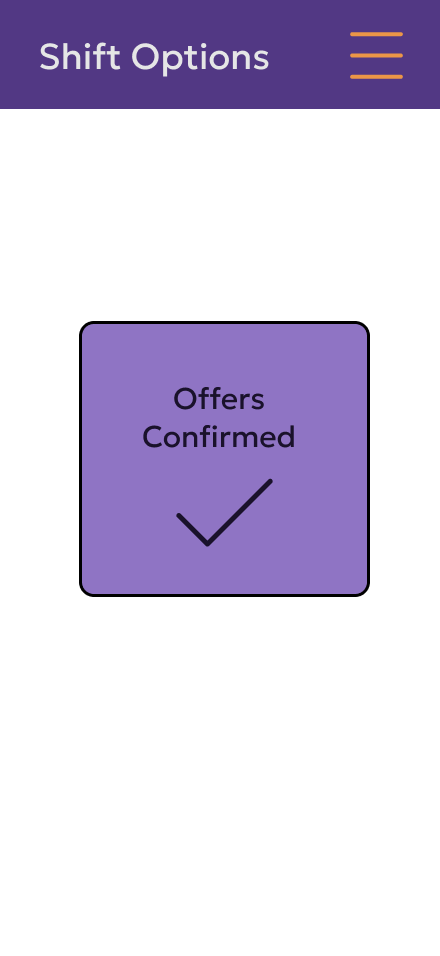
The confirmation was given its own page and a loading screen. Initial test found that users are used to being brought to another screen to confirm completion, and a loading screen shows that the page didn’t freeze.
Reflection
When I started this project, I initially thought it would be adding a section to the existing application. But as I continued, I realized a redesign of the shift section would be better. When I asked FedEx employees and managers what the most common problem they had when dealing with shift control was, it was confusing to use, and there was a lack of communication between managers and staff.
That’s why, to me, the user testing and evaluation were the most important, as they showed what I missed and how many people understood what was being communicated.
The project was never going to be a full-on schedule editor, so making that a constraint was necessary, as that would involve making a whole different design. Though something I’d improve would be the navigation, as I believe there is another design that would be easier for the user to use, like a tab navigation. This would have the added benefit of having the user click less. Overall, this project continues to help show my idea of making simple designs that are easy to understand and also pleasing to look at.
Kick Off Brief
Personas
Empathy Maps
Strategic Definition Package
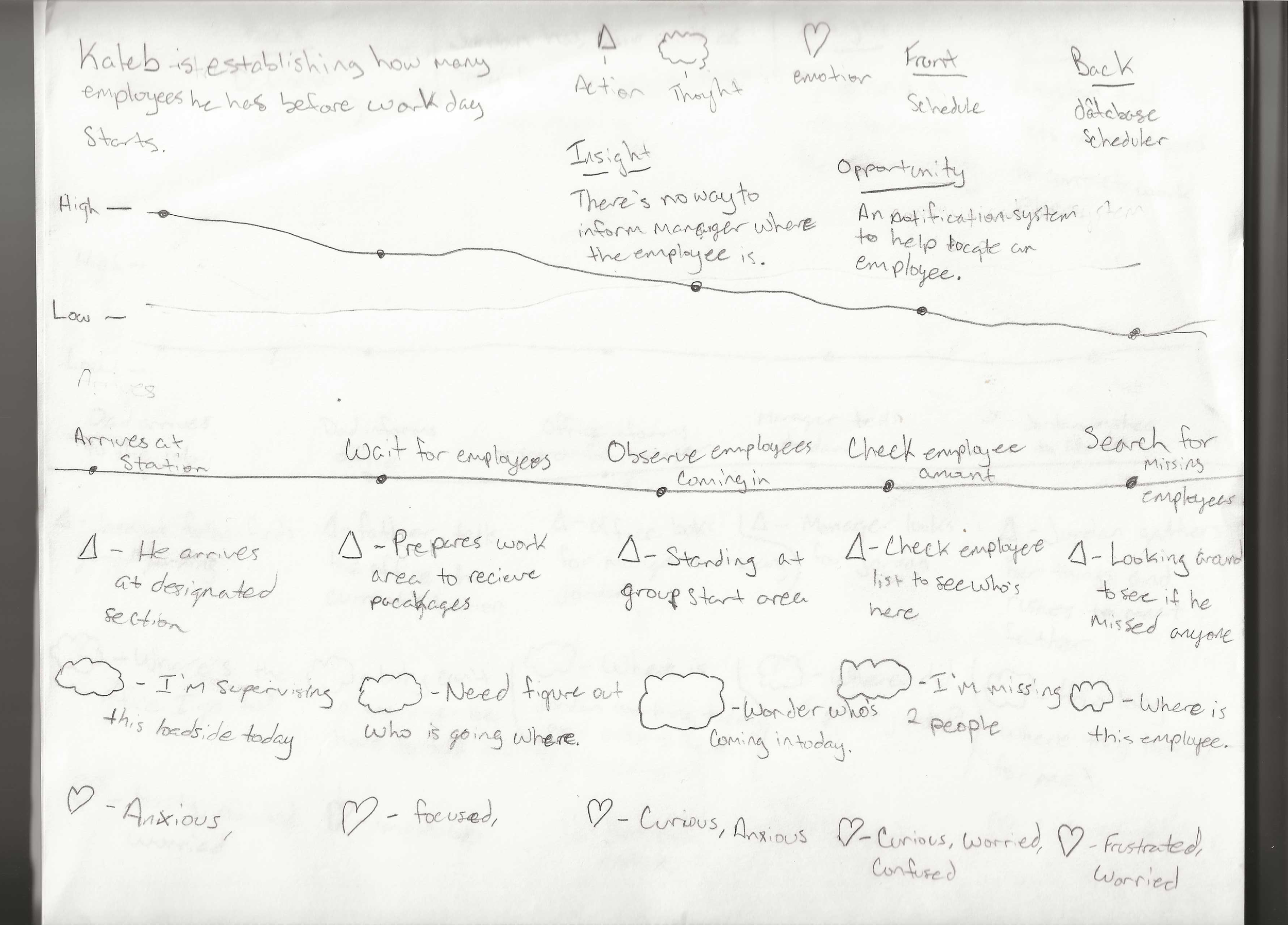
Journey Maps
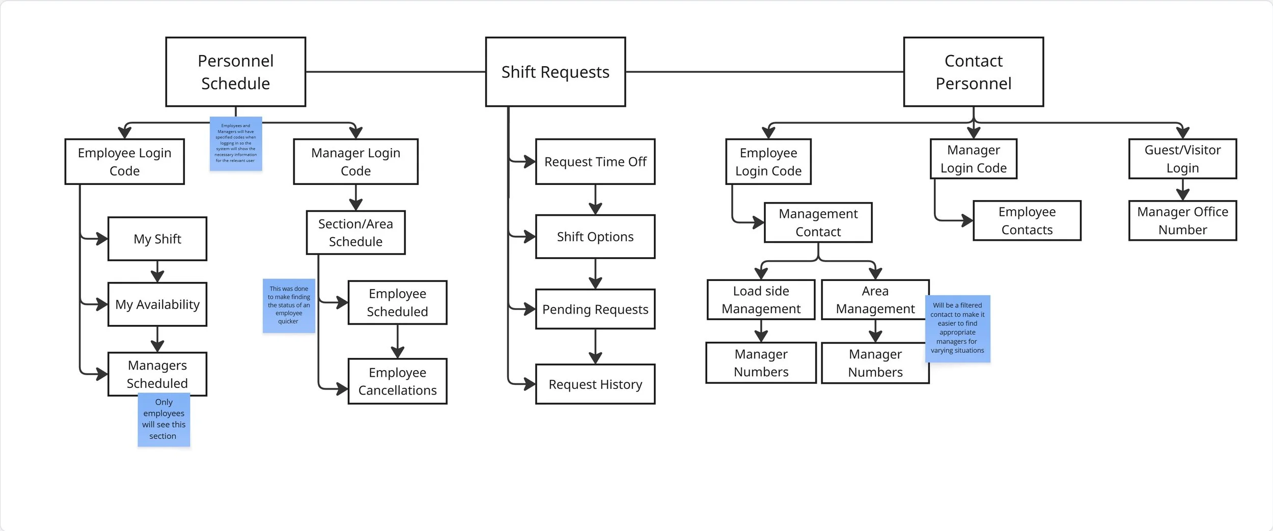
Site Map/User Flow
Concept Sketches
Initial Prototype
Linear Path


Low Fidelity Wireframes
High Fidelity
Components


IA

Testing/Refinements
Progressive Disclosure


We bring creativity and expertise to everything we do.
